MathWorks Gecko
UX strategy and usability improvements for MathWorks bug tracking system
I helped the Gecko team develop a multi-release strategy for user experience improvements, and then designed several of the initial improvements.
The challenge
MathWorks' custom bug tracking and work management tool--lovingly nicknamed "Gecko"--is the heart of a suite of internal development tools used by MathWorks' development organization. It is tightly integrated with the entire development lifecycle, particularly the build and test system.
Gecko was old enough to vote and urgently needed usability improvements. Replacing it wasn't an option; it was too tightly integrated with the rest of the development infrastructure. But major changes would be a huge effort, and might trigger resistance from long-tenured employees who had depended on Gecko for years.
We needed a strategy to prioritize improvements and break them down into chunks that could be tackled incrementally. We also needed some quick wins to demonstrate the value of continuing improvements.

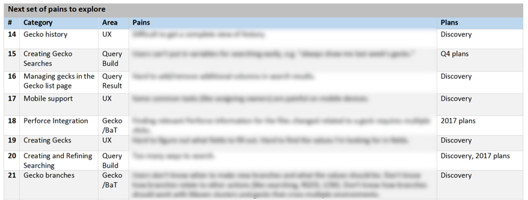
Analyzing user pains
The first step was to gather information on user pains and usability issues. Working closely with the engineering department head, I did contextual interviews to learn about user workflows and pains. We also analyzed enhancement requests, verbal feedback, and past usability test findings.
I also did heuristic evaluations of the app's navigation and search features, and analyzed several user-created Gecko "skins" to identify user pains and potential enhancements.
Data gathering turned out to be the easy part; the hard part was transforming this mountain of potential projects into something actionable!


Developing a strategy
To attack the mountain of feedback, we assembled a core strategy team with representatives from engineering, UX, and program management. A colleague and I worked together to plan and facilitate activities to categorize the feedback, brainstorm possible solutions, and break the proposed projects into manageable chunks.
After several rounds of categorization and prioritization with the core team, we ran an activity with the entire cross-functional Gecko team to prioritize, estimate, and roughly roadmap the projects. The exercises sparked many passionate and productive conversations on our goals and priorities. We emerged with a project breakdown, high-level estimates, and a rough roadmap. But more importantly, the team gained a strong sense of shared ownership of our goals.
It was also important to get buy-in from senior management on our plan. The engineering manager and I also presented several times to our department's senior engineering management to get feedback on priorities and win approval for the proposed roadmap.


Using collaborative design to kickstart improvements
My coworker and I ran several collaborative design activities to tackle specific design areas. In our initial "lightning round," we broke the team into smaller groups; each group did time-boxed rounds of requirements brainstorming and sketching and then presented to the whole team. After the session each group continued fleshing out their designs. We were able to accomplish a great amount of design work and build shared understanding of what we were trying to achieve in a relatively short time.
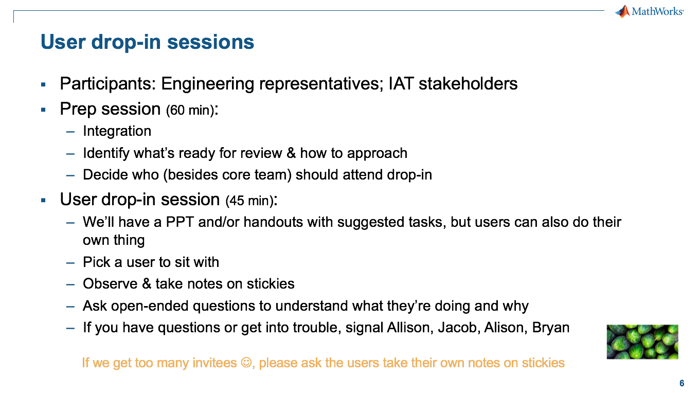
The early design work culminated in a "produce week" event where the whole team worked together to implement, integrate, collect feedback, and iterate on the designs. We ran several customer sessions where internal users could use the new features and give us feedback.
We emerged from the event with an energized team, a lot of useful customer feedback to drive improvements, and a big head start on the development work for the release.


Designing incremental improvements
Having identified the first round of projects and jumpstarted the design process, it was time for in-depth design!
The goal was to make significant improvements to the day-to-day customer experience that could be shipped relatively quickly. Redesigning the overall UI was not in scope (yet); first we needed to demonstrate the value of usability improvements to build support for the massive undertaking of a UI overhaul.
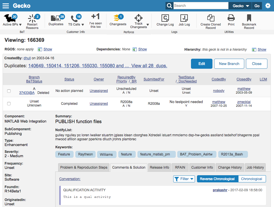
Improved comments view
In our research, we found that a big source of user pain was the commenting UI, which is one of the most frequently used features of Gecko across all user types. There were significant usability challenges in both reviewing and entering comments that cost users extra team and significant frustration. The UI was particularly frustrating for new and infrequent users who hadn't had time to learn its idiosyncrasies.

We addressed this by creating a new unified "conversations" view, which included interleaved data from all 3 fields. We color-coded different types of comments to make them easy to distinguish, and added sorting and filtering options to help users zero in on what they were looking for.
The changes made it much easier to both read and enter comments, especially for novice users and/or complex records. The new UI was also designed to adapt to different screen sizes when the entire UI became responsive down the road.

Improving query results through faceted filters
One of the most commonly used pages in Gecko is the list or query results page. We wanted to give users an easier way to refine query parameters, which originally required going to a separate, complex page.
I analyzed faceted filtering patterns in internal apps and popular public web sites and reviewed research on best practices. We asked ourselves many questions during the design process:
- Should facet options be single-select (cascading) or multi-select?
- What facets to show in what order?
- How many options to show in each facet? How to show the “overflow?”
- Dynamic refresh or submit button?
- How to display selected filters?
- How to handle the number of results for each value?
- Should facets and values change depending on the content of the query?
- How should the sidebar behave?
- How mobile-friendly does it need to be?
We ran two rounds of usability testing during the design process. The feedback helped us further refine the design and convinced the team that it was worth investing development effort in getting the interaction details right. For instance, we decided to have the results dynamically update versus requiring the user to click a Submit button.
I handed over UX responsibilities to my colleague partway through the project, but as the team lead I continued to provide input and review designs. The final version was custom-tailored to the needs of the page and was enthusiastically embraced by the user community.


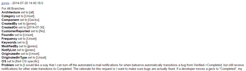
Visualizing the history of a record
Another "quick win" was to make it easier to trace the history of a record. There were a number of key questions users frequently had to answer about records (e.g. see how long a given user owned a bug, or figure out when a specific source code change was last built). Originally the only way to answer these questions was by visually parsing a long textual log:
We addressed this by creating an interactive timeline view optimized to support the most common questions users have about a record. Users can scroll back and forth on the timeline and zoom in/out to adjust the level of detail. Clicking on a bar shows the entire change record.
The new view makes it much easier to see key changes and find answers to their questions at a glance.


Hacking Gecko for different screen sizes
Gecko's fixed width UI didn't adapt well to different screen sizes. Revamping the whole UI to be responsive was out of scope, but I wanted to explore what a responsive Gecko might feel like. So, I recruited one of the Gecko developers for an upcoming MathWorks "hack day."
Within 24 hrs we developed responsive versions of two of the key screens using live data. To achieve this, the developer and I worked in parallel: I made a quick paper prototype of the UI while he set up the infrastructure. We walked through the prototype together, and he started building the UI while I made a higher-fidelity prototype. Later in the day we met to fine-tune the implemented version. At the hack day "expo" we did hands-on demos on a desktop, iPad, and smartphones and collected user feedback.
The result? We got a bunch of useful user feedback with minimal time investment. The team gained fluency with responsive design, and the project also helped socialize the idea of a more responsive Gecko. The team was able to apply some of the ideas and lessons learned to later budgeted projects.


Using prototypes to drive product vision
Early in the ideation process I put together a "vision" mockup to encourage the team to start thinking about the long-term vision even while working on incremental improvements.
The prototype was a tool for driving conversation rather than a finished product; we showed it to users during feedback sessions to get input on feature prioritization and high-level design direction. In order to focus attention appropriately, I limited changes to visual "skinning" and features we were actively discussing.
The mockup served its purpose: as a result, we identified and prioritized several projects, including work to 1) create a unified header and navigation for all of the internal development tools and 2) make key information easier to find via a toolbar and layout changes. We also put a later project on the roadmap to unify Gecko's various search mechanisms. My colleague took over in-depth design for these features.
Conclusion
Before this project the team knew there were unhappy users, but there was no clear understanding of the major problem areas, the relative priority, and the effort required to address them. The team had had a "Redesign Gecko" project on their roadmap for a number of years, but it was repeatedly pushed out because it was such a huge, amorphous effort that it was impossible to prioritize against the team's pressing other work.
By the end of this project the team had a prioritized, vetted list of projects scoped in such a way that the team could realistically tackle them incrementally. We had successfully released a number of UI & usability improvements to extremely positive customer feedback, which in turn helped build the case for prioritizing some of the larger projects.
Finally, we had a ton of fun doing it. The collaborative activities helped build a sense of unity and shared understanding in the team, with a lot of laughter along the way. What could be better?