
Tools
- Axure RP
- Photoshop
- Mac iOS Simulator
Skills
- Interaction design
- Project leadership
- Influence & persuasion
- Product thinking
Timeframe
- 2014
CA Clarity Playbook
Zero-to-one B2B iPad app for strategic planning
Overview
I was the UX lead for this enterprise iPad app over 4 major releases. I led the effort to prototype a revamped UI in 10 days so that we could get customer feedback at CA's annual customer conference. Afterwards I worked with a globally distributed team to ship several additional releases.
Playbook was one of CA's first mobile products, and I helped the team navigate the challenges of a mobile-first design. The app included configurable dashboards, an interactive project timeline, and a mint.com-like transaction management UI.
The new design achieved major usability improvements, and customers and internal stakeholders were energized by the new direction. Playbook became the flagship for a suite of mobile apps in the IT business management space.
The problem
CA already had a product, Clarity PPM, that tracked programs and projects at a very detailed level (a.k.a. "bottom-up planning"). They wanted to create an app that would support strategic ("top down") planning, and integrate it with Clarity to allow the large existing customer base to see how individual projects contributed to the organization's strategic goals.
When I came on board much of the first release had already been developed, but a usability test had just identified major issues with the UI. In addition, there were concerns the skeuomorphic design would make the app look dated given the trend towards flat design.
The team's challenge: revamp the entire user experience in time to show it to customers at CA World, less than 10 days away.

The 10-day redesign
The redesign effort kicked off with a "Design Summit" at CA HQ. I facilitated one "track" of collaborative design sessions. I also built an interactive Axure prototype as we went, which stakeholders were able to use on their own iPads to see how the app felt to use. The collaborative design and prototyping helped participants with a wide range of perspectives converge on a design direction very quickly.
After the summit we continued to iterate on the design, reviewing with stakeholders as we went. As the conference approached, I finalized the prototype and worked with a user researcher to develop a usability test script.
We met our goal: our team was able to demo the product to customers and run several usability tests at the conference. Phew!
To our relief, users found the new design much easier to use. We got very positive feedback overall about the product direction--plus lots of things to work on. Onward!
Afterwards I was asked to join the project full time as the product design lead. The design team eventually grew to include a second interaction designer, a visual designer, a UI engineer, and a user researcher, plus occasional contractors.

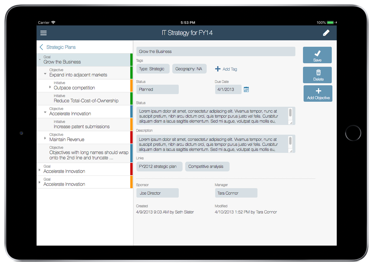
Optimizing strategic plan data entry and display
One key goal of the redesign was to help the user form the correct mental model of the relationship between strategic plan elements. We also wanted to make it as easy as possible to enter data on a touch device.
Of course, the first step was understanding the concepts myself! After that we could work towards a more intuitive UI that smoothed over the inherent complexity. I also worked closely with product management to advocate for the back end changes needed.
Users found the relationships and terminology much clearer in the redesigned version and were successfully able to enter plan data and link elements together. We continued to refine the experience in subsequent releases, drawing on the available data on best practices for touch target sizes and tablet-friendliness.


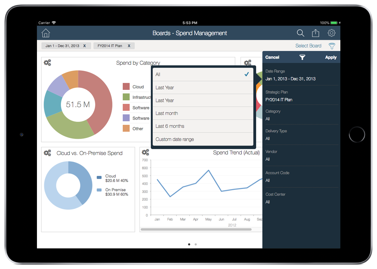
Dashboards
The whole team agreed that dashboards were a key part of Playbook's value proposition. The specific charts, however, were a matter of much discussion! To help us narrow down the requirements I facilitated dashboard brainstorming and design sessions with stakeholders and subject matter experts. We talked about the key target user groups and what questions they were trying to answer.
We ended up with a starting set of 2 "boards" with predefined viewlets that would address a core set of needs, while moving us towards the eventual goal of fully configurable boards.


Showing strategic plan elements on a timeline
To allow users to visualize how the organization's goals will be addressed over time, we created a timeline-style roadmap view. We also wanted to provide an easy wasy to manipulate project dates.
We optimized the design for direct manipulation on a touch device: the bars, icons, and grab handles are large enough be easily manipulated with a finger. Tapping on a bar shows a popover with additional detail and adds grab handles. Users can adjust the timeframe of an element by dragging the entire bar left or right or adjusting one of the grab handles.

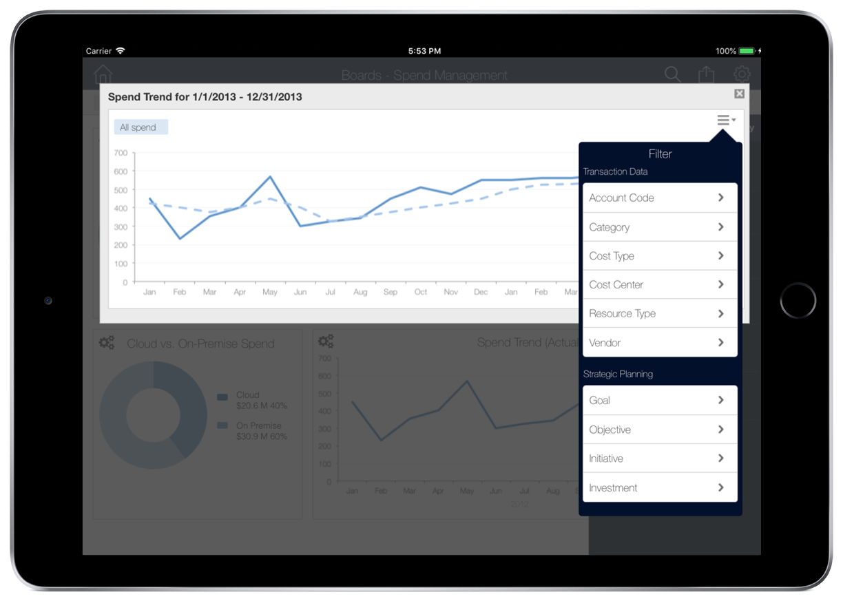
Transaction categorization and rules system
A major goal of later releases was to help IT organizations track and manage their spending along several dimensions, e.g. cloud vs. on-premise. Users needed a way to get IT-related transactions into playbook and categorize them to power the dashboards.
We envisioned a mint.com-like experience for IT users. Most of the transactions would be auto-categorized by a rules engine; we also designed a UI where users could configure custom rules. The transactions UI allowed users to view and update individual transactions: for instance, to correct the category of a transaction.

Succeeding with globally distributed Agile teams
One of the major challenges on this project was how widely the teams were distributed. Any given meeting was likely to include key participants in 4-5 time zones.

With such far-flung teams, some adjustments to the "ideal" design process were necessary. I found interactive Axure prototypes to be a critical tool for keeping everyone on the same page. I wrote lightweight specification documents when necessary for complex requirements or interactions, but found that the team worked best with an annotated "living" prototype + regular calls to build shared understanding.
One thing I learned from this project is that there's no substitute for meeting face-to-face. Our in-person release planning meetings every 6 months were crucial in getting to know my teammates as people, which went a long way towards smoothing over the inevitable misunderstandings.
I also used the release planning weeks to run as many collaborative design activities as possible. The high-level designs that emerged from these sessions kept the development team moving forward while we worked through detailed designs.
Conclusion
I learned a ton from this project. I've always been a prototyping advocate, but this project confirmed for me that interactive prototypes are especially important for mobile-first projects, where touch-friendliness and feel are crucial. There were many times when a design would look great on paper and then not work at all on the actual device. Also, in a project with such tight deadlines and such a wide geographical spread the prototype was critical in avoiding costly miscommunications.
I also learned a lot (mostly the hard way!) about how to make complex concepts intelligible on a relatively small form factor, where every pixel of real estate must be ruthlessly prioritized. The whole team was new to mobile design, and we went through many concepts that looked like Web apps before we reached something that felt mobile-native.
Finally, the project also confirmed the importance of building strong relationships with the team, particularly engineering and product management leads. This was a key project for the business unit and there were many strong opinions involved; a foundation of mutual trust and respect helped us navigate the inevitable tradeoffs and difficult conversations. I'm very proud of what the team was able to accomplish.