CA Mobile Time Manager
Enterprise mobile timesheets app
The challenge
CA Clarity PPM is a complex and mature enterprise Project & Portfolio Management tool. Its power and configurability--the very features that make it attractive to project managers--can be intimidating to users who only log into Clarity to fill out a weekly timesheet.

We wanted to design a smartphone app to help everyday users fill out a weekly timesheet on the go. The app would also allow managers to approve or reject their reports' timesheets.
The catch? An extremely tight timeframe. When I joined the team in January, development had already begun and the app was scheduled to be released for the CA World conference in April.
Designing the app
Given the timeframe, we didn't have a lot of time to do initial research with external customers. Luckily, CA uses Clarity internally, so I used other employees as a resource, including developers, sales reps, and services personnel. Empathy was easy on this one, because I had plenty of pain points with my own timesheet!
Because the same design had to work on both iOS and Android, I did a lot of pattern research to identify design patterns that worked on both platforms. I also looked at many other apps for inspiration.
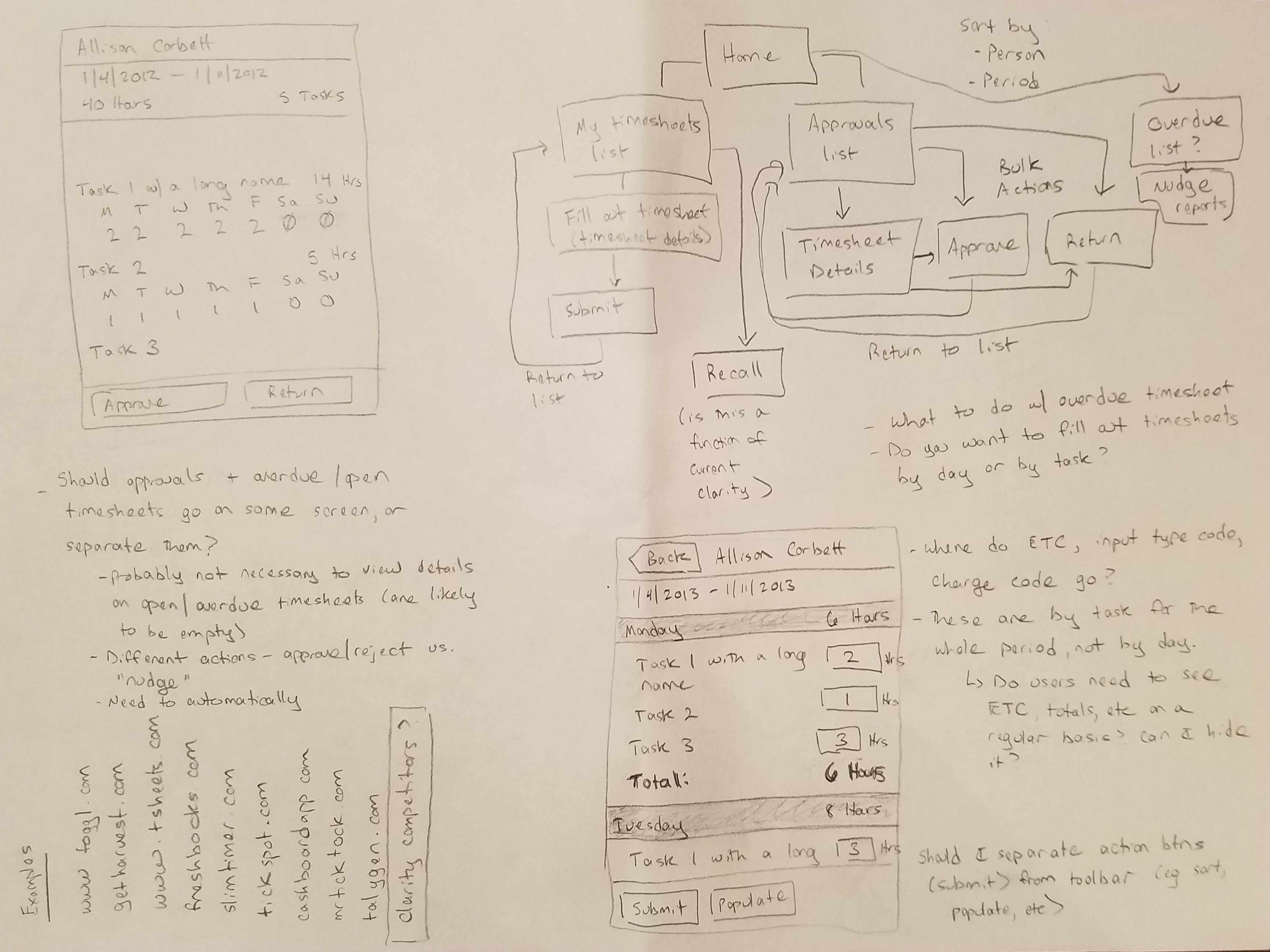
I started with a bunch of sketching to flesh out the requirements and explore different ideas.


The team consisted of me, two developers in Chicago, a product manager in California, and a visual designer in Israel. The small team size heped us move very quickly. But the spread of time zones made it difficult to collaborate in real time.
To get around this, I did a ton of prototyping in Axure, which allowed us to experience how the designs "felt" on actual devices. We eliminated many versions that looked great on a computer but didn't work well on an actual smartphone. The prototypes were indispensable in making our ideas concrete and keeping us on the same page across several cities and time zones.
Navigating the app
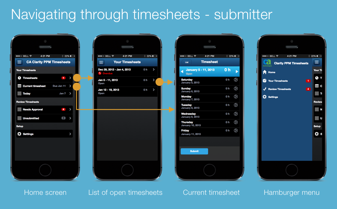
We identified 2 major user roles for the app: a submitter, who would use the app to fill out and submit their weekly timesheets, and an approver, who would use the app to approve or reject their reports' timesheets. Submitters could be virtually anyone in an organization, whereas approvers were generally managers.
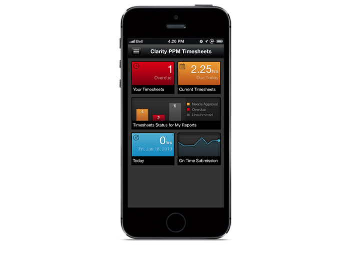
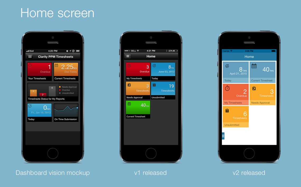
The app used a hierarchical navigation model, but the home screen provided shortcuts to key screens--for instance, your current timesheet. Eventually as the mobile pattern library evolved, the home screen grew into a dashboard with prioritized tiles.
Making it easy to enter time
We quickly realized that Clarity's project-centric grid approach wasn't a feasible approach on a small smartphone screen. After working through the use cases, we decided to make the phone version "day-centric." We hoped this would encourage users to enter time during the week rather than waiting until Friday afternoon (or later!)--a major problem with the Web app.
To make it as easy as possible to enter time, we made the time entry fields large and touch-friendly with a numeric keyboard. We also prepopulated the tasks to minimize searching and selection.
To add additional tasks, we created a custom list screen with a search box, which was important because the task names were usually defined by project managers and were not necessarily intuitive to users.
Users selected tasks by swiping right. At the time this was not as common a gesture as it is now, and we tested it several times with users to make sure it was discoverable. The blue "tab" at the left-hand side is an affordance to encourage users to swipe.
We placed the action buttons at the bottom of the screen where they would be easy to reach with a thumb, and color-coded positive and negative actions.

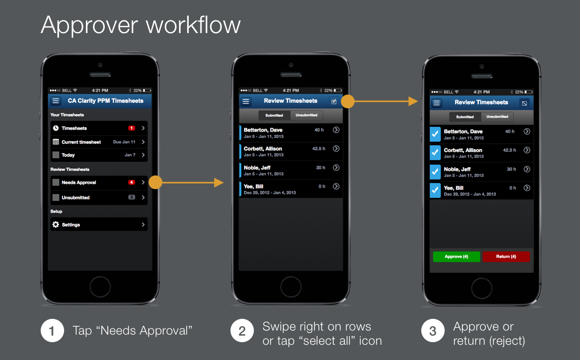
Approving timesheets
After talking to internal managers who approve timesheets, we found that the most common actions were 1) approve submitted timesheets and 2) remind employees who have not yet submitted their timesheets to do so.
Both of these actions are within easy one-tap reach from the app's home screen. The approver can use a segmented control to toggle between submitted and unsubmitted timesheets; the available actions change from "approve/reject" to "remind" depending on which set of timesheets is displayed.
As in the submitter workflow, the action buttons are touch-friendly, color-coded, and within easy reach of a user's thumb.
Home screen design
As the business unit began working on other mobile apps and the Mobile Framework project took off, the home page design evolved towards a more dashboard-like approach that could be reused for other apps.
Between the first and second releases it became clear that the industry trend was towards "flat" design, so our visual designer created a new UI theme to match.
Results
We ultimately finished a beta in time for CA World in April. I worked with a user researcher to run usability tests with customers at the conference, and we made a number of improvements and released v1 in June.
CA Mobile Time Manager was one of CA's first mobile apps, and it energized the Clarity sales force and excited the customer base. Its success became the foundation of the mobile pattern library project.
I learned a ton from this project. Among the most important was that it's okay--and even desirable--to reformat information entirely for a mobile experience. If we had settled for our initial designs, which attempted to duplicate the Web app's grid on a much smaller screen, we would have ended up with fewer screens and significantly impaired usability.
Another thing I took away from this effort was how much a small "pod" of a product manager, a designer, and an excellent front end developer can accomplish in a short time, even when they have never met in person. We moved fast, we broke things, and we met our goals.
Tools
- Axure RP
- Mac iOS simulator
- Photoshop