MathWorks Test Results Database (TRDB)
Internal Web app for investigating software test failures
Overview
I owned all aspects of UX and design for this redesign of a key application for MathWorks' internal development organization. I performed user research, helped the team define the release scope and priorities, performed all UI and interaction design work, and worked with the team through implementation and release. After the 2.0 release I worked with the team to make additional improvements.
The problem
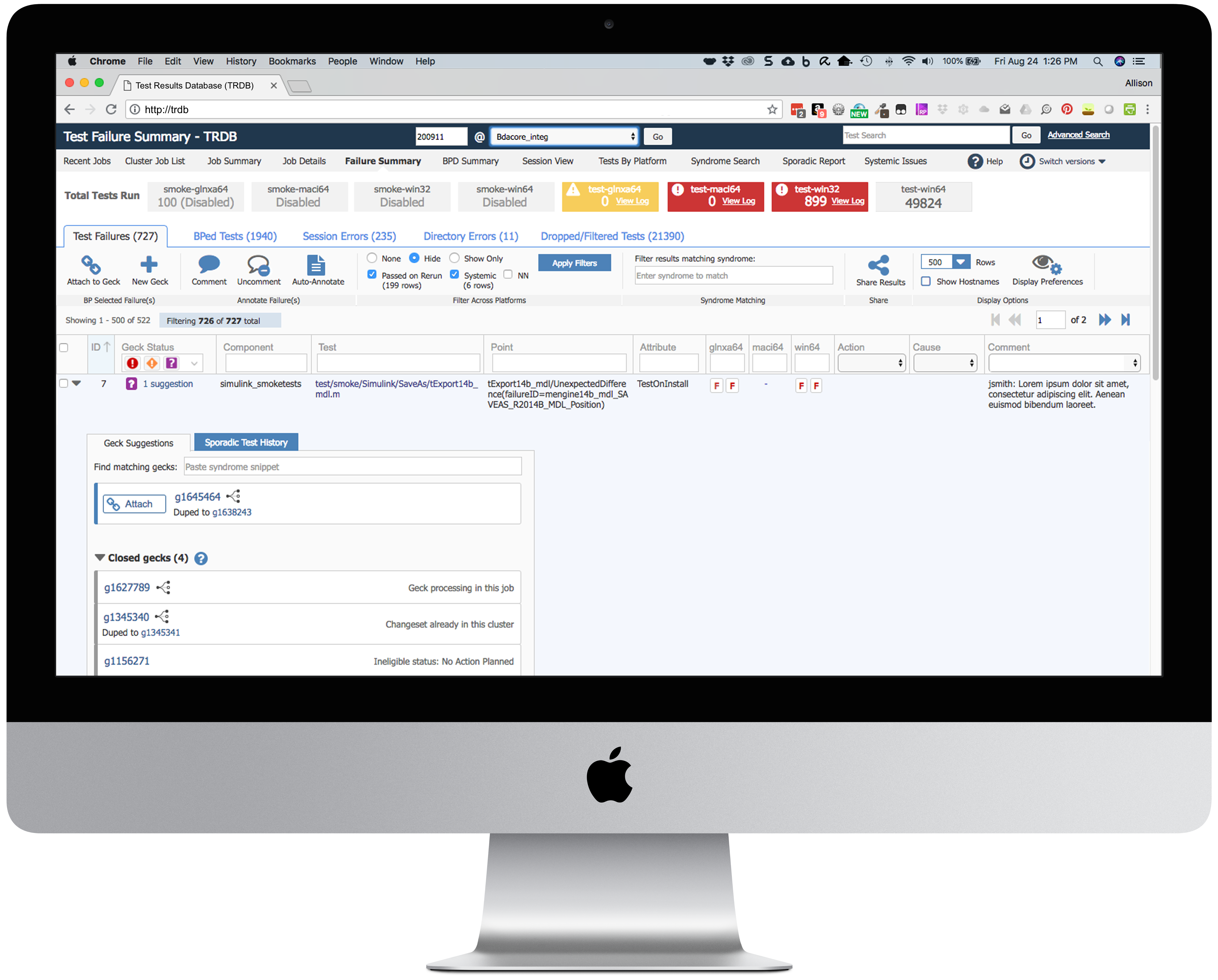
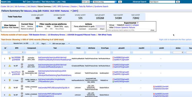
The Test Results Database (TRDB) is a key internal app used by 1500+ members of the MathWorks development organization to review and investigate failures in automated software tests. The area is complex and technical and involves many concepts unique to MathWorks' build and test environment.
The core UI had remained unchanged for many years and users were campaigning for major improvements. In addition, the user demographics were changing rapidly. Originally, the UI had mostly been used by a team of expert users. As the development organization grew, developers were taking over some of these responsibilities. They typically used TRDB once every 4-5 weeks on a rotation and had plenty of time to forget the UI in between.
When I came on board the team was starting a major project to redesign and rearchitect the major functions of the app. Our challenge: design a TRDB 2.0 that would be intuitive enough for occasional users, while not losing ground for the power users.
Improving complex workflows
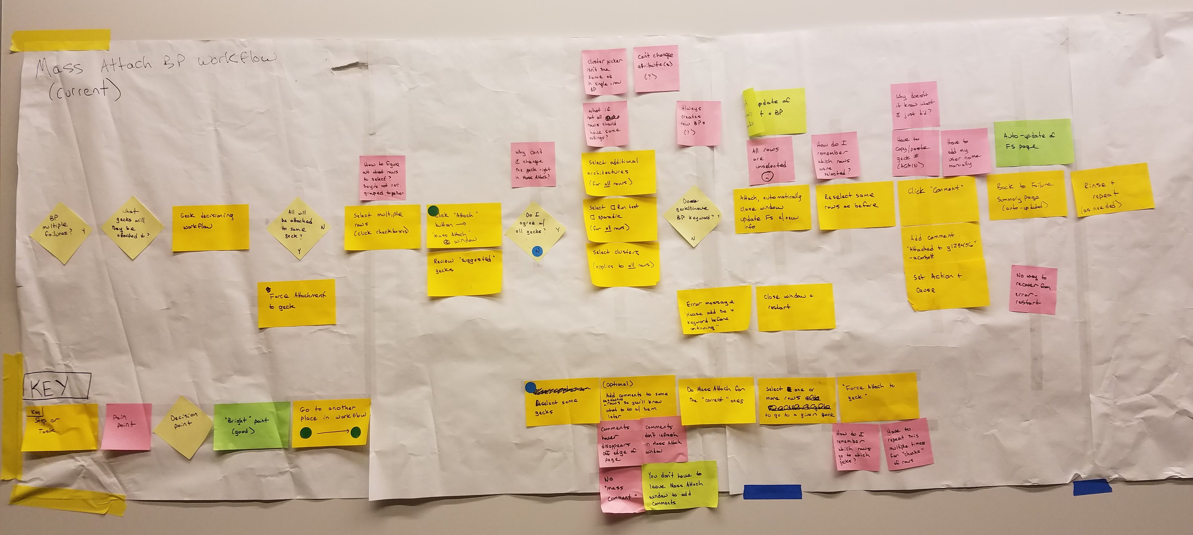
Because TRDB is an internal app, we were blessed with easy user access. We interviewed and observed users to understand how they used the existing version and identify pain points. I ran several collaborative workflow mapping exercises to help us understand major workflows.
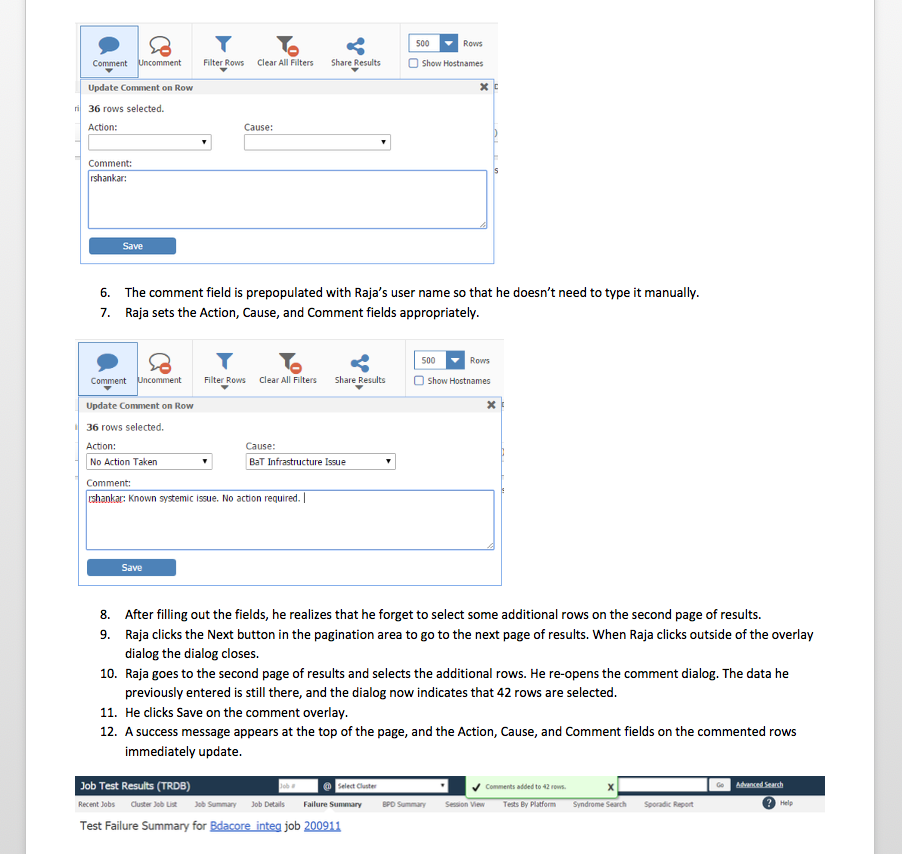
The key workflow in TRDB consists of identifying a number of rows that all failed due to the same cause and then taking one of several possible actions for those rows.
We found that this workflow required a large number of manual, repetitive steps. The good news was that the steps were largely the same for novice and expert users, so improvements would benefit both groups.
Because of these findings, we made workflow improvements a key focus of the new version. Some of the improvements we made included:
- Changed the default page filters to show only rows that were likely to require action
- Improved search to help users identify rows that all failed with the same symptoms and take action on all of them at once.
- Streamlined action workflow by reducing interstitial popups and better integrating those functions elsewhere in the workflow
- Consolidated two confusing multi-select workflows into a single dialog so that users didn't have to decide between them
- Cut out many manual commenting steps by automatically adding boilerplate comments to rows when a user takes action on the row
- Reduced context switching by moving action dialogs from separate popup windows to overlays
- Simplified action dialogs by improving defaults and reducing extraneous information
Along the way we realized that the "right" process wasn't clearly defined and/or communicated in many situations. I facilitated discussions with stakeholders and subject matter experts to more clearly define best practices so that the UI could support them.
Once we had made progress on the redesign, we did another workflow map of our proposed design to ensure that we were reaching our workflow goals. For one common workflow we reduced a 12-step process with a lot of repetitive steps and manual copy-pasting to a streamlined 3-step process. We also removed many decision points that were causing cognitive fatigue.

Facilitating learning and discoverability
During our early interviews, users kept asking us for timesaving features...that actually already existed! Users who were aware of them were often using them in suboptimal ways, inadvertently creating more work for themselves. We realized we needed to make key features easier to discover, and the UI needed to guide users towards the optimal workflow.
To address the discoverability and learnability problems, I proposed a toolstrip. The pattern is a standard in MathWorks' products, which meant it would be familiar to all of the app's users. It would also address some of the discoverability problems by putting most of the app's features in a central location.
Sketching & Wireframing
To develop the new UI, we started with a lot of sketching and whiteboarding. I facilitated brainstorming sessions with the whole team, including several developers and quality engineers and the development manager.
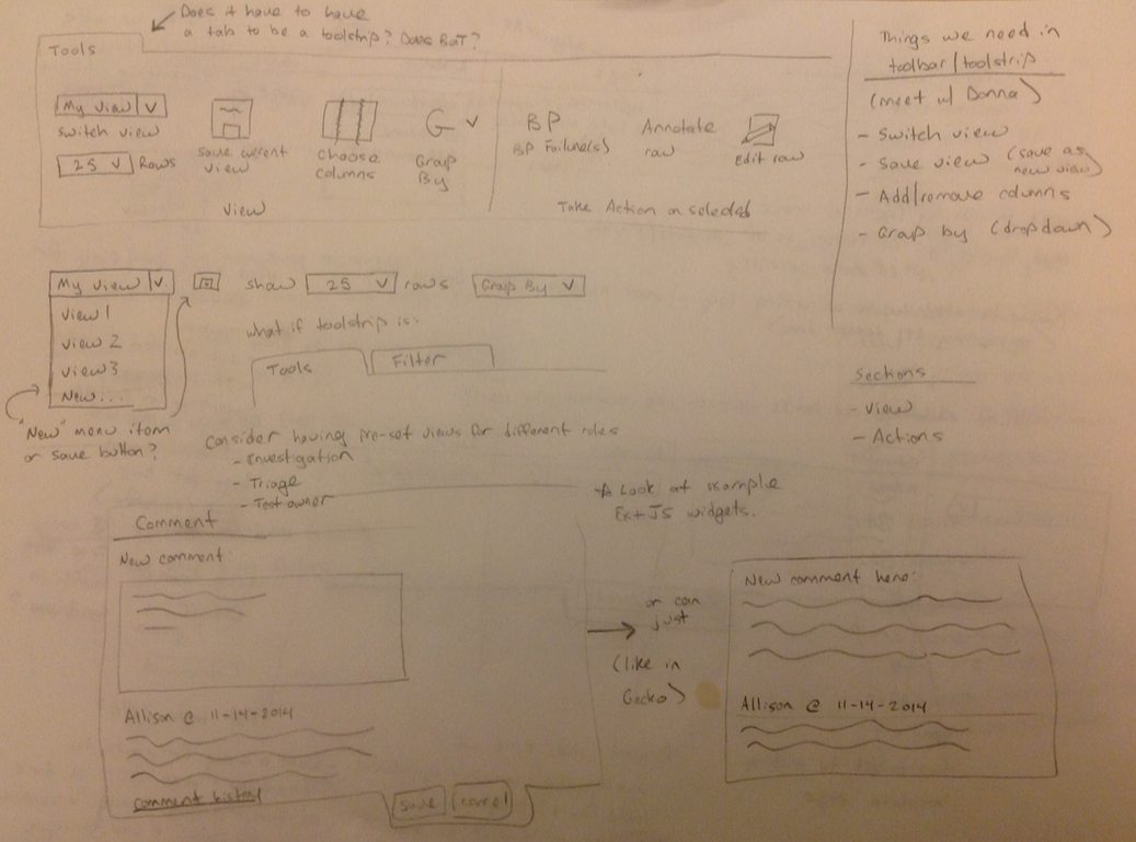
Next, I started fleshing out the ideas into wireframes using Axure RP. Rapid prototyping allowed us to work through many different ideas very quickly, with plenty of design review and iteration along the way. The details evolved a lot as the project moved forward, but these early concepts were immensely helpful in developing a big-picture vision of what we wanted the final product to be.


High-Fidelity Designs
After several rounds of iteration and design review, we moved on to higher-fidelity designs. I wrote a detailed functional spec for the new design, and then worked closely with the developer during the implementation phase.


As an internal-facing team we didn't have the budget or resources for extensive visual design work, but I felt it was important to refresh the look and feel. I was able to draw on other examples and published toolstrip standards to skin the redesign in a manner consistent with other MathWorks applications. The TRDB redesign helped build organizational support for devoting additional resources for internal visual & interaction design standards.
Validating our design
I planned and moderated two rounds of usability testing, one at the wireframe stage and one when the design was close to complete. I worked with the team to figure out the best way to structure the studies to answer the team's questions. We kept the tasks as open-ended as possible so that we could learn as much as possible about the users' natural mental models and workflow.
The complete cross-functional team attended the tests and took notes on Post-Its, which we then affinity-mapped as a team after the sessions. We emerged happy with the overall direction, but with lots of ideas for improvements. Back to the drawing board!

Developing and releasing the new version
Because we were making such a major change to a key application, it was important to get stakeholder buy-in and communicate the coming changes. To help with this effort, I ran design reviews and roadshows with important user groups to socialize the design and collect additional feedback.
We initially released the app to a hand-picked group of pilot users; this allowed us to collect feedback from people using the new version for their day-to-day work with their actual data. I helped the team plan the pilot and collect, analyze and prioritize feedback.
During the rollout I did several rounds of UI testing, drafted many of the release communications, and wrote a chunk of the user-facing documentation. All of this work helped the final rollout go smoothly.
Results
Users loved the workflow improvements and requested that we revamp several other key internal applications along the same lines. In addition, the user research we did as part of this project served as a foundation for numerous later improvements.
