Tools
- Sketch
- Figma
- Axure RP
- Miro
- Pendo
Skills
- Interaction design
- Interviews
- Usability test planning & facilitation
- Product strategy
- Presentations & training
- Influence & persuasion
- Sense of humor
Timeframe
- 2018 - 2025
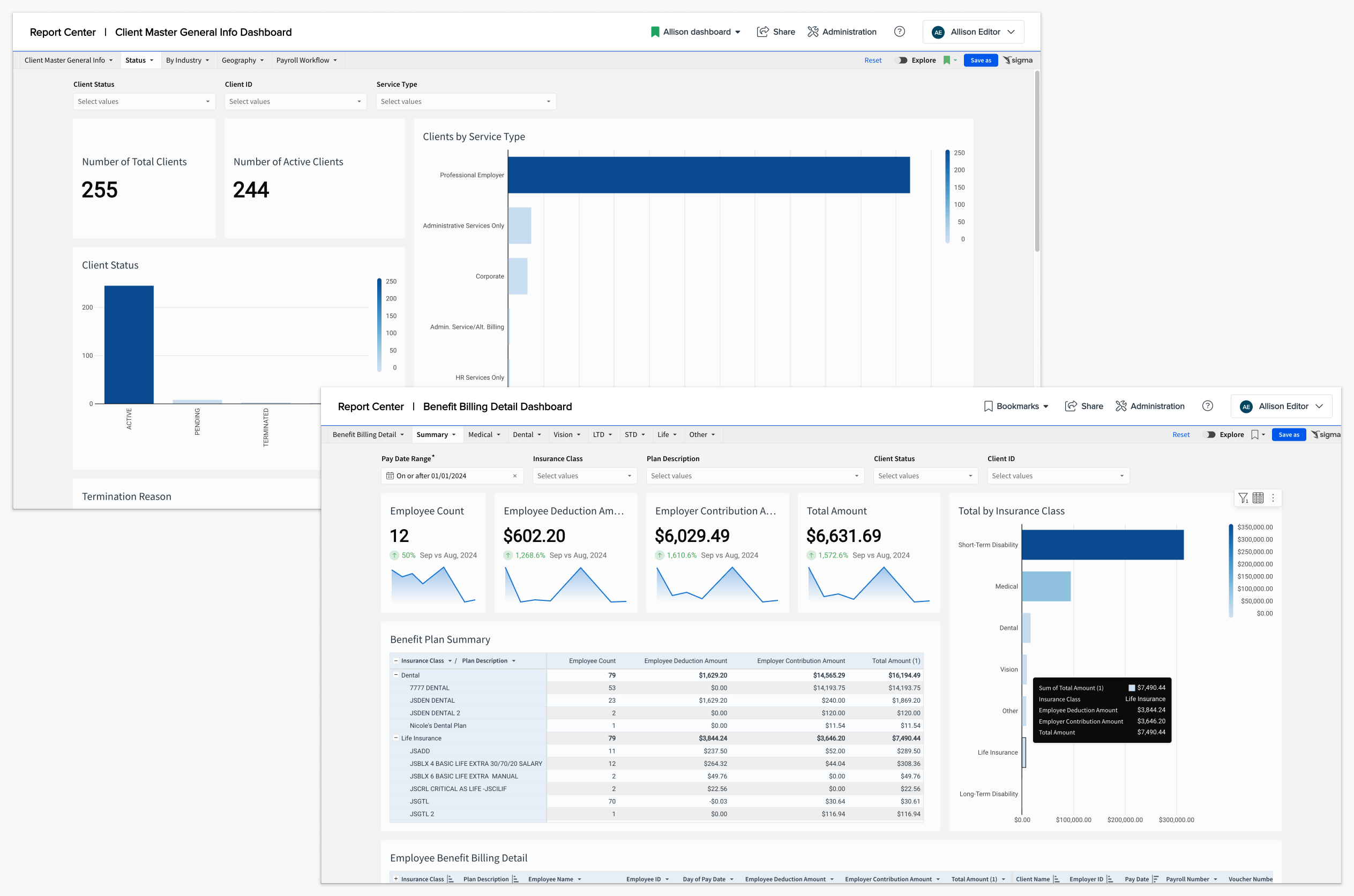
PrismHR Report Center
B2B reporting tool for a top payroll system for small and medium business
I was the UX lead and sole designer on this zero-to-one project that took PrismHR from a patchwork of static, out-of-date reporting tools to an industry-leading reporting experience built on a Snowflake data warehouse processing millions of records.
The Challenge
In 2018, if you were a Prism customer who needed information, you had to first choose which of the 5 or 6 possible reporting tools to use. Then, you had to choose from hundreds—or perhaps thousands—of reports, each with its own purpose and set of fields. And you'd better hope you liked the format, because the reports were completely static.
A small subset of advanced users had access to an ad hoc report builder, which required strong data knowledge to use effectively, and required a support ticket each time you wanted to add a field we didn't already have mapped.
In short: the reporting world was confusing, overwhelming, and out of date.
We set out to transform this into a modern, fully interactive reporting platform.
Using Data & Prototyping to Drive Product Alignment
When I joined the project in 2018 the team was in the early conceptual and architectural phase. One immediate challenge was that reporting was a "target-rich environment" — there were dozens of potential reporting problems to solve, at least 4 legacy reporting tools to retire, and no shortage of opinions on which ones to tackle first.
Luckily, the team had a lot of data on our users already and lots of domain expertise, so my first task was to help the product manager drive alignment towards our first release. I realized that part of the problem was that different stakeholders were making different assumptions about who we were targeting, which naturally led to different priorities and approaches.
I ran a very lightweight user profile mapping exercise with the product manager to flush out our existing research, and then took the output of that exercise (basically a single Powerpoint slide) to the other stakeholders to drive alignment.
As I started working through design concepts I maintained a working prototype (often with multiple design alternatives) to drive discussions with the internal team and customers. This gave us something concrete to ground discussions and ensure we were all working from a common set of assumptions. Later I used the working prototype to run formative usability tests with users from different potential target groups.
These activities gave us the working hypothesis that drove our first several releases: our primary target users were specialists in payroll, benefits, accounting, and HR who worked at our HR service provider partners. These folks had plenty of HR domain expertise, but most were not experts in reporting or business intelligence; the biggest skill set they had in common was Excel.
It also gave us our initial goal: replace the hundreds of static reports in our oldest legacy system, HRP, which would allow us to retire that system and recoup the infrastructure and support costs. Most importantly, it gave us clarity on what was NOT our initial goal: although we ultimately wanted to provide a full ad hoc report builder with advanced BI and analytics, we decided that was a much longer term goal.
It became much easier to drive towards our first release once it was clear we were all charging in the same direction!
Customizing Our BI Platforms
Our research showed that the users we were targeting for our initial release were often employees of small businesses who were wearing many hats, and learning a new reporting system was not at the top of their priority lists. Most had no coding or SQL experience, and they would be moving from static reports with minimal configuration options to a system that would be much more powerful but also more complex.
Our core Informer platform was a powerful and flexible system that was well-suited for analysts and BI experts. However, after analyzing the UI I had concerns about discoverability and usability for our audience of HR personnel. I drew on our customer research and discussions on target profiles to make a case for customizing the UI for our target users, first to our internal team and then to Entrinsik.
Luckily, Entrinsik was very open to feedback, and we ended up forming a very close working relationship. Their developers helped us customize the platform for our user base, and they were able to leverage our research to propagate improvements to their core product — a win-win!
Building an Interactive UI
One of our core goals was to move from static reports to a fully interactive UI. We added a number of features to make reports more interactive, including:
- Grouping
- Sorting
- Filtering
- Aggregates (Totals)
- Pivoting
All of this was made more complicated by the fact that some of our most important reports might return tens of thousands to millions of records.
Grouping, Sorting, & Filtering
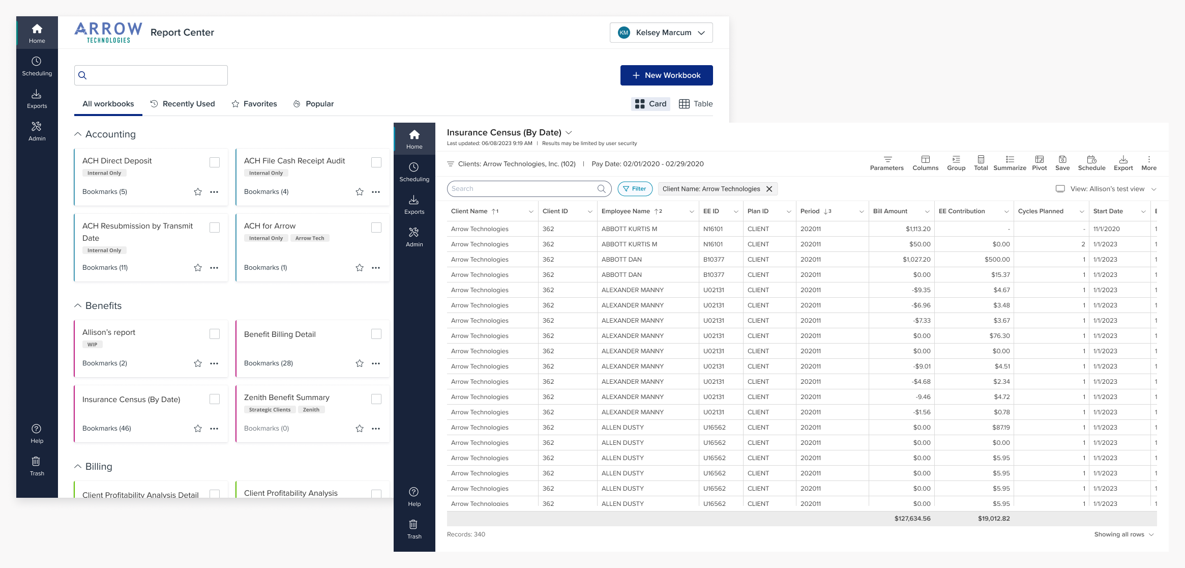
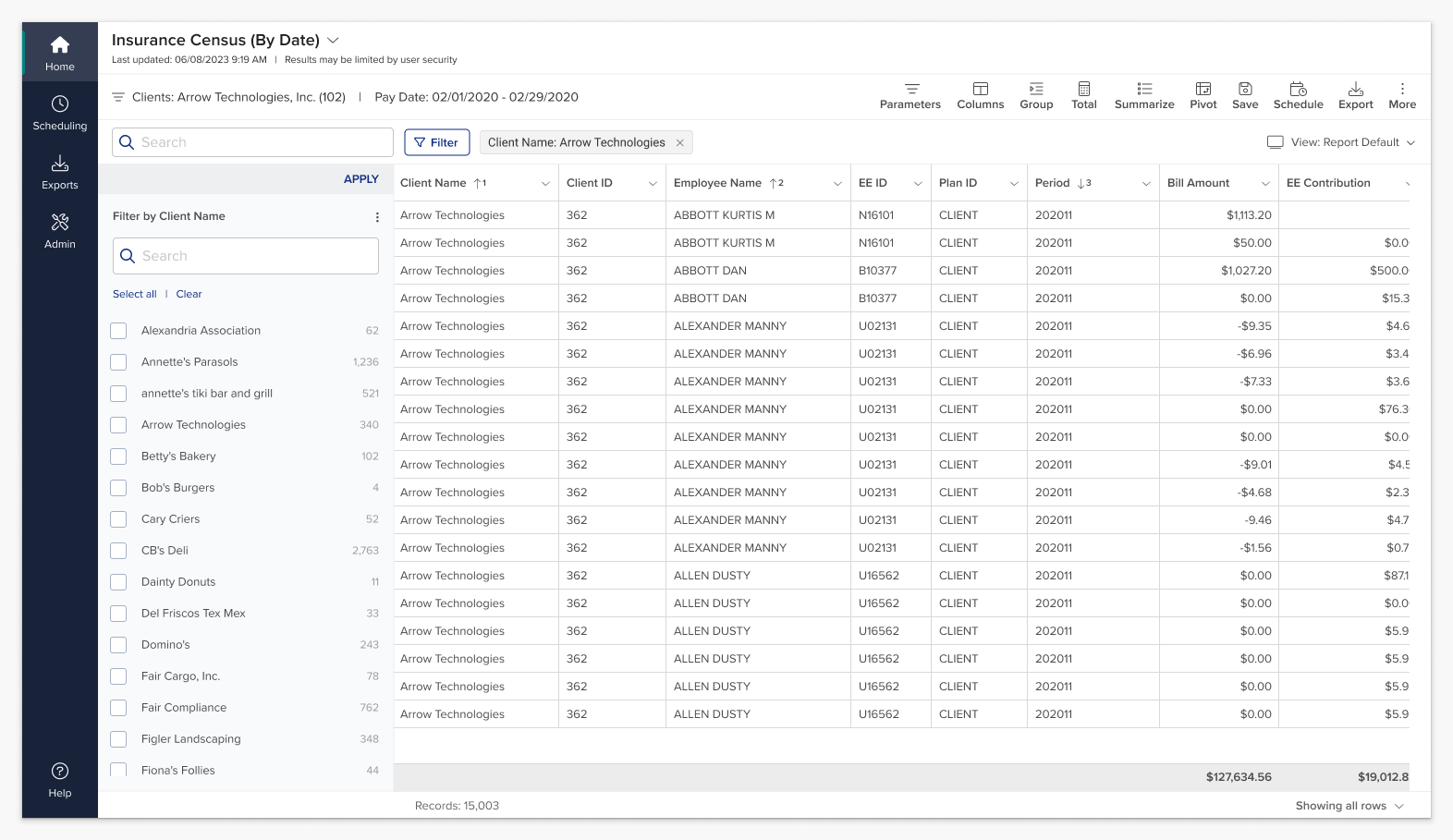
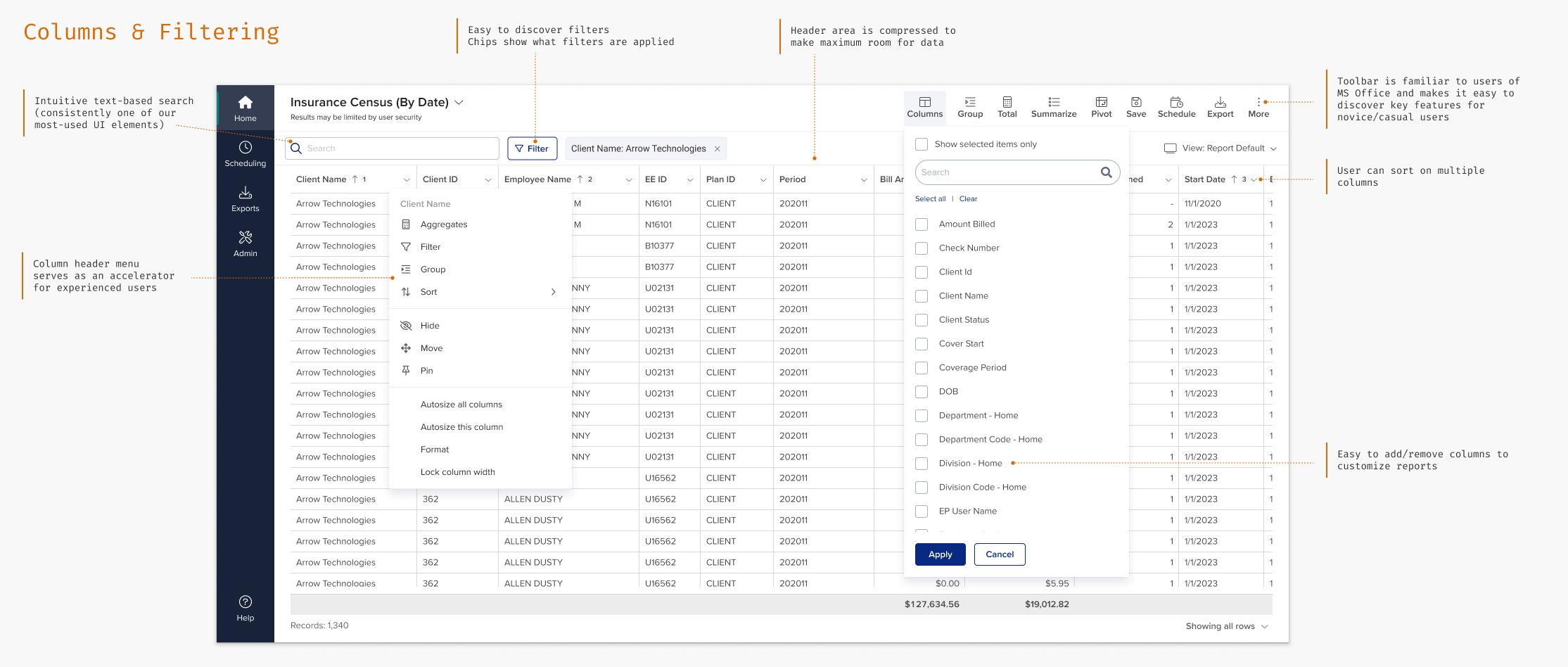
One of the biggest wins of Report Center was simply allowing users to choose exactly what data to see. Prism's original reports showed a static set of columns and supported a limited set of input parameters. Almost all reports were single-client, so if a payroll service provider needed cross-client reporting (a very common user case) they had to run the report multiple times.
In Report Center we show a default set of columns for each report, but users can easily show additional columns. Reports are cross-client by default, and users can filter on any column in the report.
Grouping
Grouping allows users to cluster related data together. This is particularly important for HR reports, where users frequently need to see all the data for a single client, employee, or department in one place.
Grouping was a new concept for our users, and our research showed that they expected to see groups as headers, with totals at the bottom. This wasn't the way our underlying grid component (Ag-grid) behaved by default, so we heavily customized the grid to match our users' mental models.
In the UI we show the totals on group headers so that they're always visible, with grand totals at the bottom. We further customized PDF exports to show group headers at the top and totals at the bottom of each group, with grand totals at the end.

Report Scheduling
Our users needed a way to schedule report exports to run automatically on a regular cadence. One key use case was for service providers to send CSV files in a specific format to an FTP site for 3rd parties like benefits carriers to use for data interchange.
We leveraged the built-in scheduling capabilities of Informer and then Sigma for our scheduling feature, which required me to develop a deep understanding of how the vendor's platform worked and then build an appropriate UI on top.
Our initial release allows scheduling CSV and JSON files to an SFTP site, with additional destinations and formats to come.

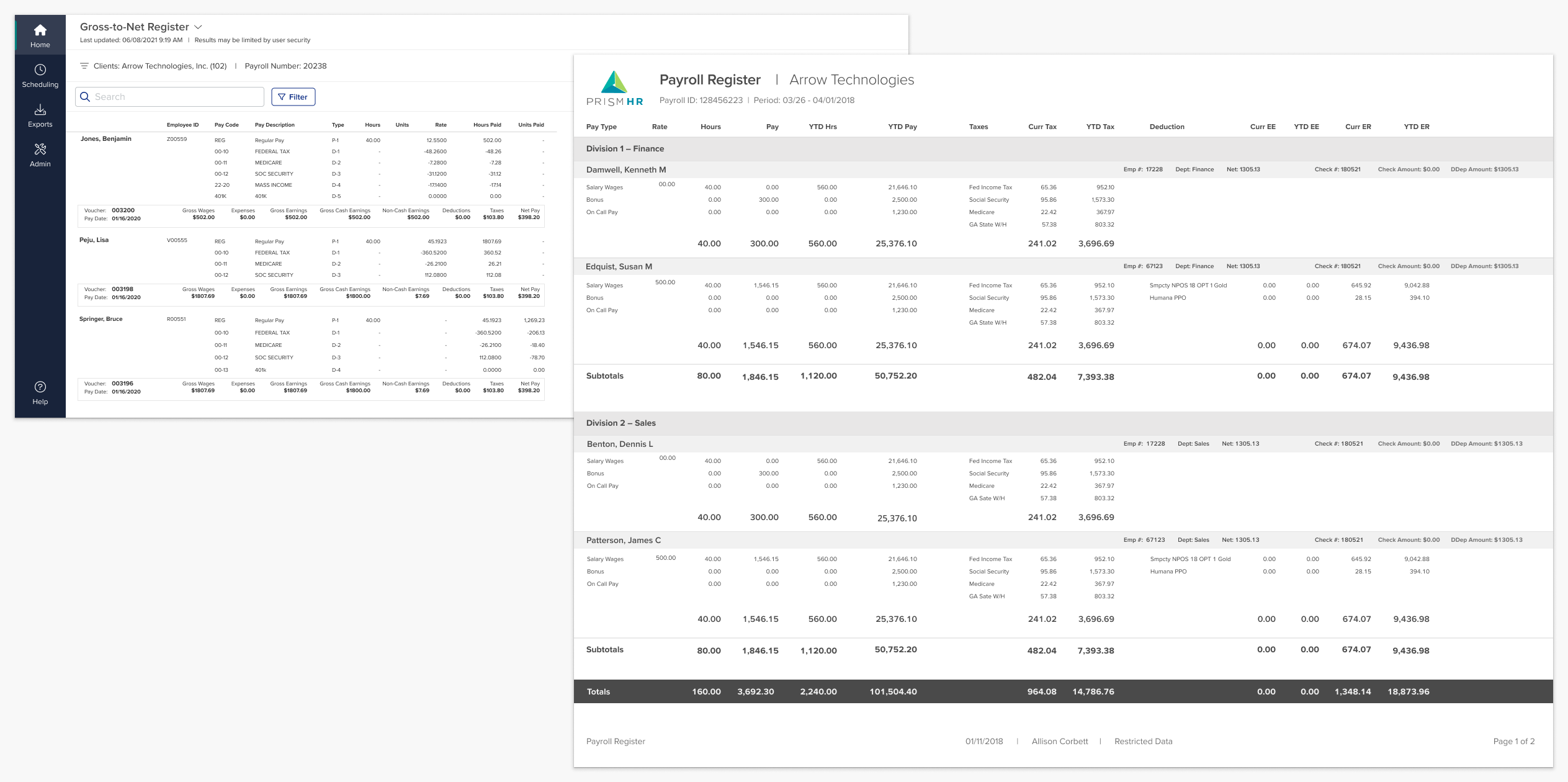
Templated Reports
Some key reports like payroll registers and payroll stubs required unique formats.
I worked with the lead developer from Entrinsik to design a custom HTML templating system for these unique reports. I designed a gross-to-net register, payroll register and several other “templated” reports. Most of these reports would be printed, so the designs needed to be readable on screen and fit on a standard 8.5 x 11 sheet of paper.
The Importance of Being Performant
One key lesson from this project was that performance is one of the most important user experience factors — if not the most important — in a data-centric tool like Report Center.
My initial design assumed a certain level of performance from our back end. As the system scaled to millions of records, performance degraded and UI interactions that I had expected to be immediate came with a high "cost" in wait time. Users were (understandably) very frustrated and increasingly less willing to experiment, which affected learnability.
In addition to work on the back end, we tried to mitigate the effects with a number of changes to the UI; for instance, we added an initial parameters page to help limit the initial amount of data we pulled and added Apply buttons to toolbar buttons to reduce the number of queries. These changes were necessary, but came with unfortunate UI tradeoffs.
We finally moved to a Snowflake data warehouse with a Sigma Computing front end, which gave us the performance our customers needed. There were tradeoffs with this approach as well, but ultimately no amount of UI tinkering would have been able to achieve the fundamental user need of quick access to data.
Although the new platform was a change for us and our customers, it came with new opportunities — like dashboards & analytics!
Designing Dashboards
Dashboards and analytics were a new world for Prism's customers, who were used to static tabular reports. The Product Manager and I worked together to create a set of out-of-the-box dashboards that would be useful to customers and also show off the capabilities of our data warehouse.
I presented in a number of webinars on dashboards and co-presented a session on dashboard design best practices at Prism's annual conference. I also conducted dashboard discovery workshops for 50+ customers.
Product Leadership
I partnered with several product managers and a product analyst to prioritize work and define requirements throughout the project. I established weekly design review sessions with the cross-functional leads and collaborated with them on release and sprint planning, helping to ensure that the team was aligned on priorities and approach.
During a 9-month period where we were between PMs, I worked with our (very busy!) Director of Product to fill the gaps and keep the team moving. I broke down upcoming features, prioritized UX work in our backlog, worked with dev to identify and resolve tradeoffs, wrote Jira tickets, and led estimation and refinement sessions.
As a result the team was able to keep forward momentum and deliver on its commitments during a time when there might otherwise have been a gap in leadership.
Making Change Easy(ier)
Our conversations with customers illuminated just how disruptive new releases and functionality changes were to our users. PrismHR sells its platform to HR outsourcing companies, who in turn brand it and offer it to their customers. Every time we made a change, it sent a ripple effect downstream in documentation, training, and SOPs. Our customers had a hard time adopting new features, and in fact often missed them altogether.
We needed to reduce friction and make both the platform as a whole and any changes easier to adopt. To help with the transition, I wrote most of the documentation for our GA release and worked with our technical writer on later rounds. The product manager and I ran drop-in office hour sessions to let customers ask questions and get help, and I looked for patterns in the questions and problem areas to feed improvements back into the product backlog.
I taught myself to use Pendo and ran a series of guides and walkthroughs. I also created an in-app feedback link and set up Pendo's webhook integration to have comments automatically sent to the team's Slack channel. Along the way I became one of our in-house Pendo experts and helped other products get it up and running.
Later, when we moved to the Sigma platform, I helped the product manager run a series of free training sessions. Many of our webinars had 600-800 registrants; they were collectively the best-attended sessions Prism had ever had! I also co-led several in-person hands-on workshops with 40+ attendees each.
Lessons Learned
My work on Report Center allowed me to take a new product from concept through 4+ years of releases, and I learned so much from the process.
In addition to the lessons on performance and collaboration (see above), this project taught me a lot about systems thinking and managing tradeoffs in complex platforms. There were many times where I had to be willing to sacrifice something in the UI in service of the larger goals of the platform, like performance or data integrity or migrations.
As a designer it's easy to focus on the UI, but this project really underlined the fact that that in a complex platform like Report Center, probably 80% of the "user experience" has nothing to do with the UI.
Results
These days the reporting world looks much brighter for Prism customers. We fully retired our oldest legacy reporting system in 2020, and many of the static reports in the core PrismHR system now have fully interactive versions in Report Center.
In 2024 we released full ad hoc report building off of most data from the core Prism payroll application, fulfilling our dreams from the earliest days of the project. We're now in the process of integrating data from Prism's other products. Report Center is well on its way to becoming the unified reporting platform for all PrismHR products.
In January 2025 the Report Center home page had about 125K visits; there are about 17K active users, representing about a quarter of our service provider users, and adoption is growing steadily month over month. Reporting has moved from a cost center and a driver of customer dissatisfaction to a competitive advantage and a growing source of revenue.
When I joined the project in 2019, reporting consistently received some of the most negative comments on our in-product NPS surveys. Between 2019 and 2025 the overall Prism NPS score has climbed 81 points and negative comments referencing reporting have significantly decreased. We've been able to monetize reporting licenses, transforming it from a cost center and a drain on product reputation to a source of revenue.