
Tools
- Figma
- Miro
- Confluence
- Microsoft Loop
Skills
- Product leadership
- Design system development
- Interaction design
- Influence & persuasion
- Sense of humor
PrismHR Unified Employee Experience
Redesign of suite of three applications used by 2.5M employees, plus a new design system
PrismHR's suite of SMB employee applications were out of date and clunky. When our new executive team challenged us to create a new, modern unified experience in time for our customer conference in less than six months, my small team rolled up our sleeves and dug in.
As a principal designer, I played a key leadership role in the project. We achieved our goal: we created a new design system while redesigning all three apps in parallel. We were able to demo working software at the conference, shipped a beta in less than nine months, and had the entire customer base migrated less than a year after our first demo.
Our unified experience won a bronze Stevie Award and achieved major wins for our customers and our business.
The Challenge
PrismHR's employee-facing apps—the Employee Portal, Employee Onboarding, and Benefits Enrollment applications—were feature-rich and configurable, but our sales team was losing deals due to an outdated user experience. Although they were part of the same user workflow, the apps had been built by different teams on different tech stacks at different times, and they showed it.
We also needed to converge the design of PrismHR's applications with a new acquisition, Namely, which was slated to form the backbone of a new business unit.
My Role
As one of two principal designers, I negotiated scope, coordinated with team leads and stakeholders, and drove the implementation process through to completion. I also jumped in to fill the gap when our product manager was on leave.
I worked closely with our UX Director, other designers, and stakeholders across the organization to define many of the core patterns and design decisions for the new experience. I redesigned the Benefits Enrollment application myself (see separate case study), and reviewed the screens from the other two applications.

A Consumer Audience Inside a B2B Platform
Prism's employee experience applications are used by over 2.5 million employees of small and medium businesses who use PrismHR's platform for HR and payroll.
The target users include any employee of a small or medium business; they range from farm workers to health care staff to restaurant waitstaff and technology workers. It's essentially a consumer audience inside Prism's wider B2B business.
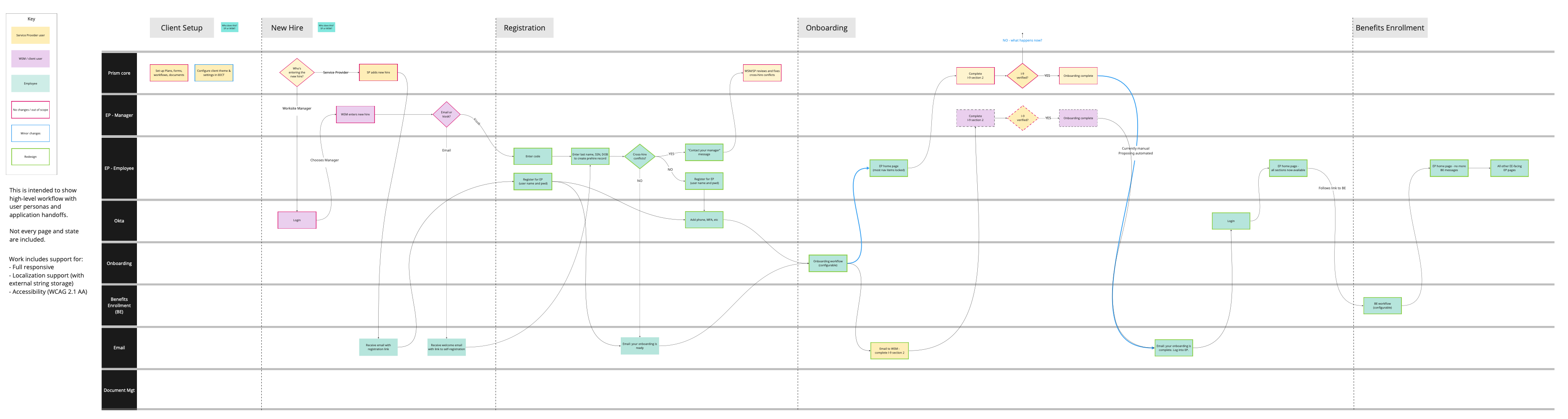
Mapping the Customer Journey
To create a unified experience, it was particularly important to understand the customer journey across the three applications. I made this journey map in Miro, with input from the other designers, to show the frontstage and backstage workflows for the Employee Experience applications.
Creating a New Design System
PrismHR's existing design system was due for a refresh, so we decided to use Namely's design system as a starting point for the new unified system.
We were lucky to have about a month's warning before the dev teams were available to start work. We used that month to analyze Namely's design system and start defining the new unified version, while designing the new versions of the three applications at the same time. A teammate described it as “designing the plane while taxiing down the runway!”

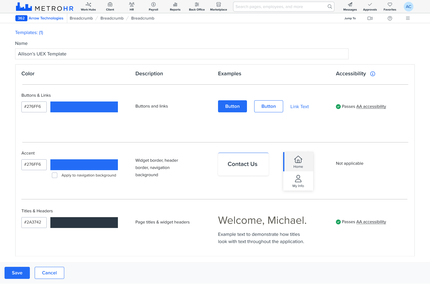
As the design system grew, we found that both designers and developers needed a quick way to find official examples and specs.
We created a complete style guide in Figma, based on the sticker sheet examples we found in several other reference design systems. It gave us an easy place to link Jira tickets and copy components to individual designs. This quickly became the go-to resource for both designers and developers.

I created many of the Figma components and worked with the dev team to implement the new components and styles. I also wrote about half of the component specifications and pattern guidelines.

Responsive by Design
Over half of the visits on Prism's employee experience apps come from mobile, so it was crucial for the design to support a range of devices and screen sizes. Namely's design system had virtually no responsive design, so we had to create this from scratch.
My team defined a set of 4 breakpoints (from mobile up to XL) and ensured that our core navigation and layout patterns worked at each breakpoint. I worked with the dev team to implement and test the new components at a range of screen sizes.

Theming and White Labeling
Prism's customers needed to be able to “white label” our applications to resell to their own customers. We designed a new theming approach that supported custom logos and two colors: a link/interactive color and an accent color.
The navigation automatically calculates its background color based on the selected accent color.

Prioritizing Accessibility
My team championed accessibility from the start of the project. We educated the cross-functional teams on accessibility guidelines and ensured that accessibility was part of the acceptance criteria for every development story.
I tested the implemented designs for accessibility and gave feedback for improvements to the dev team.
We achieved WCAG AA compliance for the new design — a first for PrismHR's apps!
Showing Off at PrismHR LIVE
We met our goal of showing working software at our PrismHR LIVE conference. The Unified Employee Experience had its own room, where we showed off the new software, answered questions, and solicited customer feedback.
Customers loved the new look and feel and the usability improvements. Our head of Product said it was the most positive vibe he'd ever seen at one of our conferences!
The Results
We shipped a beta in September, and the finished experience in November. We got extremely positive feedback from customers and our internal and channel sales teams.
“[The] prospect ... was very impressed by the Unified Employee Experience on all fronts and especially remarked about how bare bones the [competitor's] portal [is]. Put that in your pipe and smoke it!” — Sales engineer
We put substantial effort into making it easy and seamless to enable the new Unified Employee Experience, but in the end the improvements were so popular that we met remarkably little resistance. We were able to completely sunset the legacy system only 1.5 years from the redesign kickoff—a record for PrismHR migrations.
“Had 3 smb sales demos yesterday ... prospects are loving the demo and the clients are happy. The new UEX combined with the Enhanced Dashboard sure do lift the cloud and participants are paying closer attention to how advanced the OB/BE is ... I’m so proud of us!” — Sales engineer
The Unified Employee Experience project won a bronze Stevie Award from the American Business Awards in the New Product category.
But maybe the most satisfying outcome was being able to use the redesigned experience to enroll in my own benefits!