Tools
- Figma
- Miro
Skills
- Interaction design
- Design system development
- Product leadership
- Influence & persuasion
- Sense of humor
PrismHR Benefits Enrollment Workflow
Redesign of a complex workflow used by 2.5M employees
A Six-Month Redesign of a Mission-Critical Legacy App
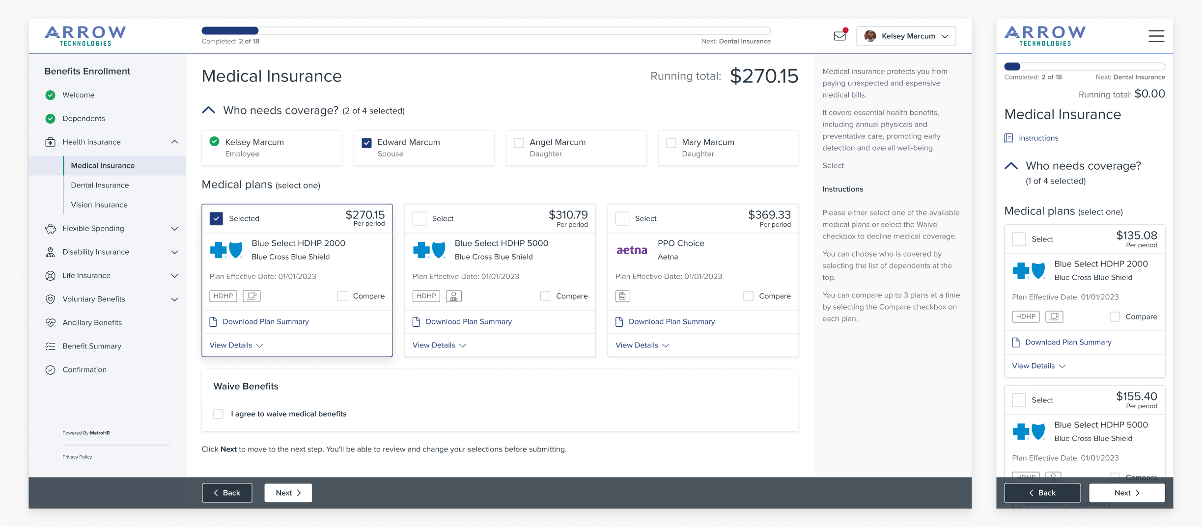
PrismHR's Benefits Enrollment (BE) application is used by over 2.5 million employees of small and medium businesses to enroll in benefits. It's one of Prism's core products and a cornerstone of Prism's suite of employee-facing applications.
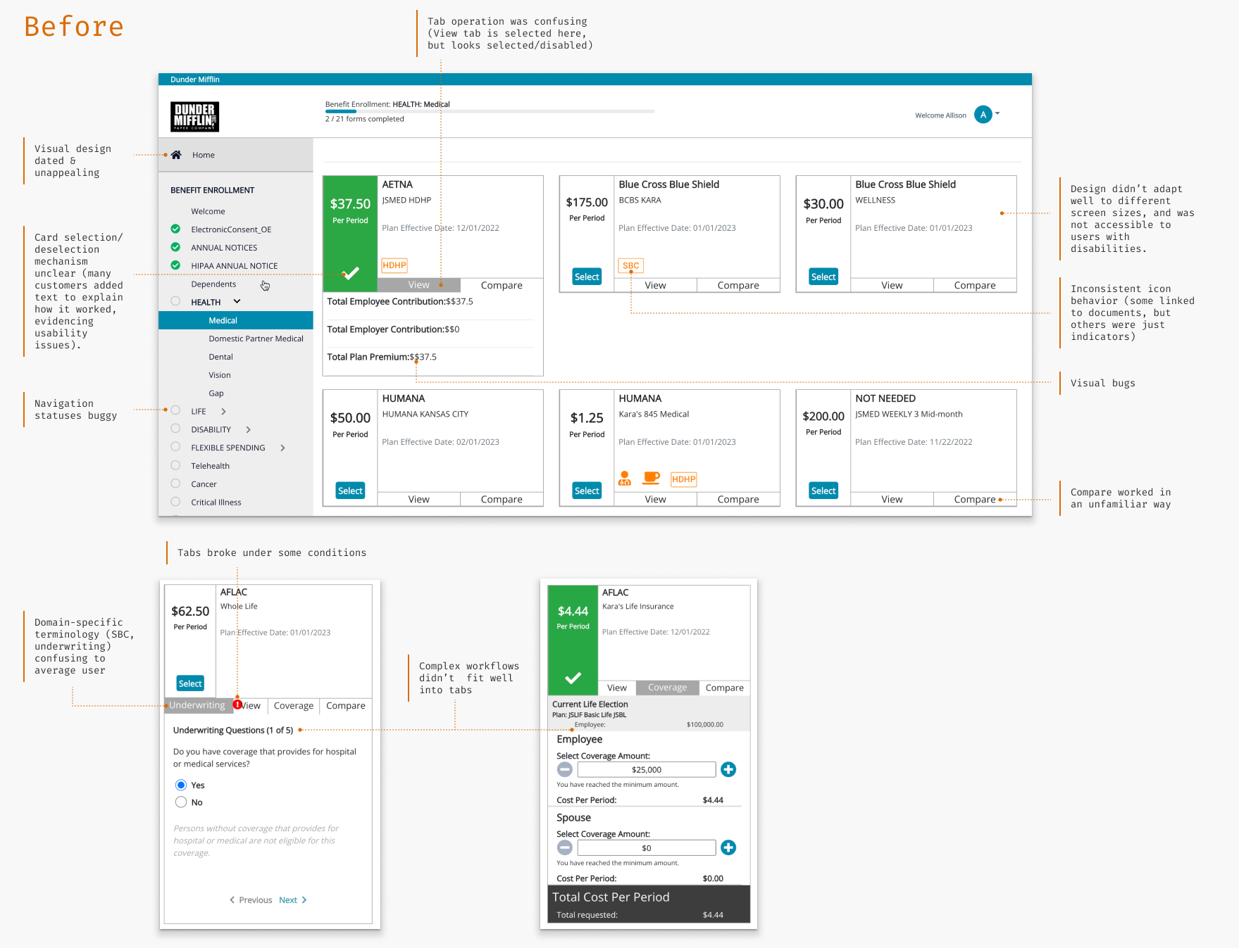
BE is extremely feature-rich and flexible, but the UI was outdated, confusing, and inconsistent with the other applications in the suite. Our sales team was losing deals due to the dated UI, and we got consistently negative feedback from customers about the experience. As part of the overall project to unify PrismHR's employee applications, I set out to transform BE into a modern, intuitive experience.
The new design earned rave reviews from customers and internal stakeholders, and the overall Unified Employee Experience project won a bronze Stevie Award from the American Business Awards in the New Product category.
Benefits Enrollment Users
The target users range from farm workers to health care staff to restaurant waitstaff and technology workers: basically anyone who works for a small business. It's essentially a consumer audience inside Prism's wider B2B business.
Since employees only use BE when they join a company or go through annual open enrollment, users are "perpetual novices." In addition, benefits is a complex space full of unfamiliar concepts and opaque terminology, and mistakes carry real financial consequences. Overall the benefits enrollment process is complex and stressful, and our benefits enrollment application was definitely not helping.
Challenges
Our executive team challenged us to have working software for all three products in the Unified Employee Experience within about six months: in time to get hands on feedback at our customer conference in June. This was a big job, given that the three products were on different tech stacks and had complex business logic built up over many years.
This was a key strategic project for PrismHR and had a lot of eyes on it. I hadn't worked with the Product Manager or team before, so I was coming into a high-pressure project where I was going to ask a lot of the team without a built-up store of trust. I knew I would have to very quickly establish credibility and build relationships with the team so we could work together towards our common goals.
In situations like this, I find that curiosity and active listening go a long way. A light touch and a sense of humor helps too! I asked a lot of questions to understand the team's perspective and history, which was also important because the team had a ton of subject matter expertise, and I had a lot to learn about benefits enrollment!
I tried to be clear about tradeoffs and involve the team in my thought process so we could work together to find the best solution. Whenever possible, I used prototypes and Miro boards to make decisions concrete. In the end the PM, dev and QA leads became friends and trusted partners. That trust was crucial to delivering a complex project in a short timeframe.
Identifying UI Pain Points
I did a thorough analysis of the overall user journey and the BE application in particular. The journey-level challenges are covered in the Unified Employee Experience Case Study. I also identified many pain points in the Benefits Enrollment UI:
Using Prototyping to Define the Vision
Due to the tight timeframe and the complexity of the legacy back end, the team initially targeted a light reskin. However, I felt strongly that there were significant UI and workflow issues that a basic reskin wouldn't address.
Through many conversations, I discovered that the team desperately wanted to make improvements, but there were real risks of breaking workflows in active use by millions of employees. So, my job was to thoroughly understand the constraints and work with the team to define a vision that would meet the user experience objectives while being implementable in our tight timeframe — without messing up employees' benefits!
I rapid-prototyped several versions of the design, ranging from a basic reskin to a full redesign, and walked through each version with the cross-functional leads. After seeing the difference in the experience, they were excited about the possibilities of a full redesign.
I used prototyping throughout the project, starting with high-level concepts and working my way down to detailed designs. The collaborative vision work helped the team develop a shared understanding of the scope and goals, and ultimately allowed us to feel confident committing to a wider scope.
In the end we descoped major architectural and framework changes, but committed to a full revamp of the UI. The version we eventually released substantially matched the original vision I proposed. And we met our deadline goals too!
Benefit Cards
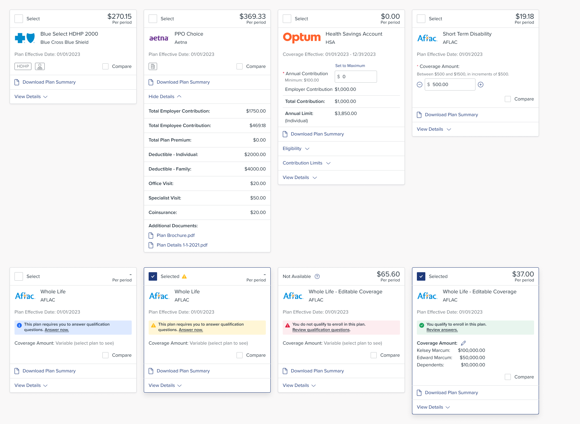
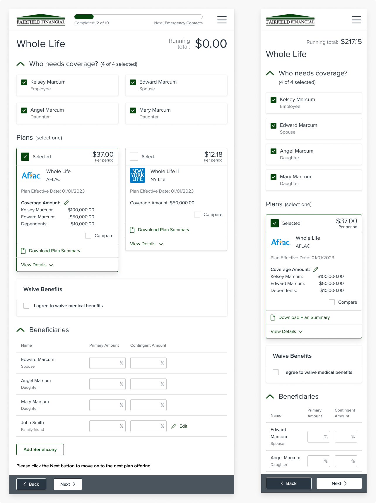
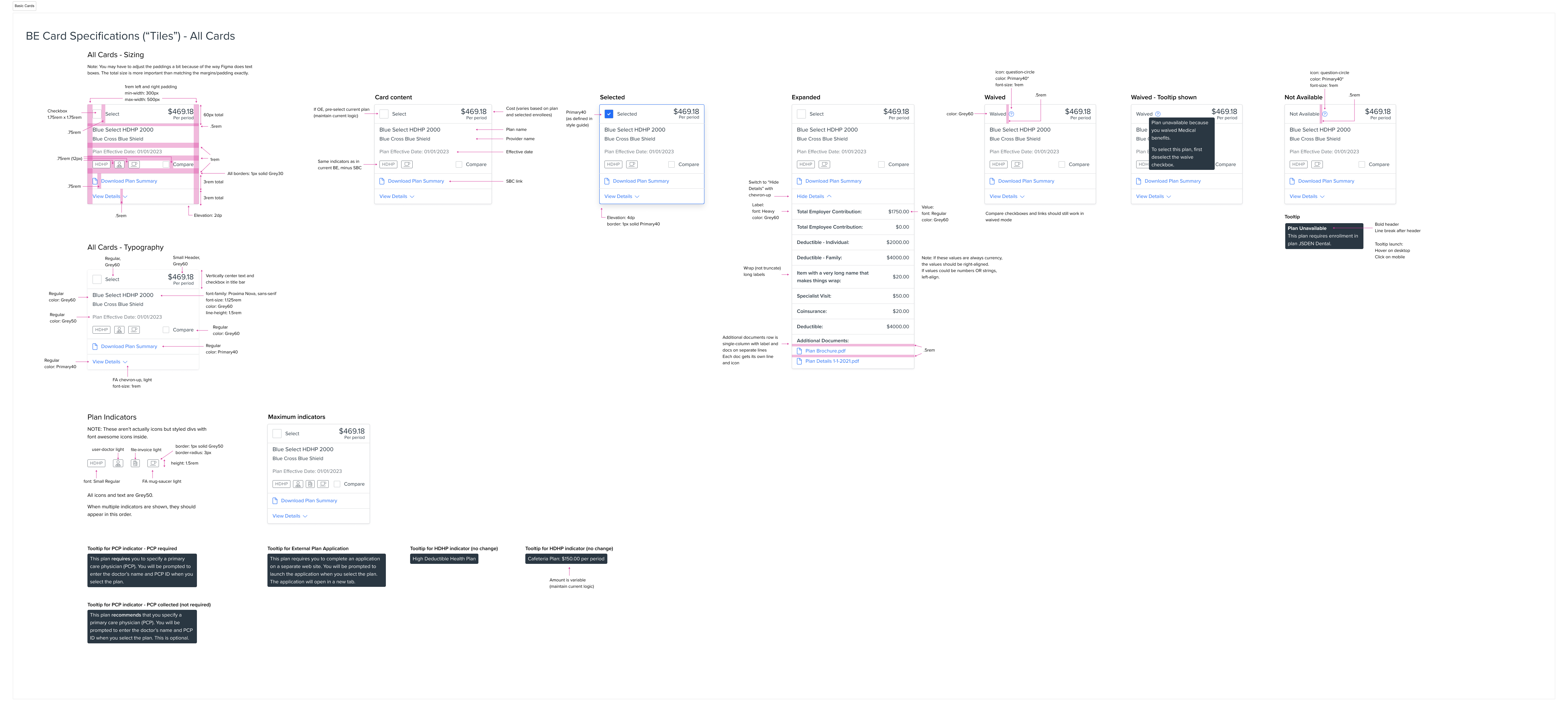
The core of the benefits enrollment workflow is the benefit card, with each card representing a benefit plan employees can select. My analysis identified six core types of cards, each with several distinct variations depending on plan configuration.
Virtually every detail of the plans is configurable, and all the text is localizable in English and Spanish, so the design had to support different numbers of plans, amounts of text, and plan details.
I created a new core card design with variations for all six different plan types. The cards had a clearer selection mechanism to support our "perpetual novice" audience and guide users through complex workflows, such as specifying coverage amounts for life insurance plans, answering qualification (underwriting) questions, and entering a primary care provider.
The new cards are designed to accommodate everything from desktop to mobile screen sizes and form a strong backbone for the entire workflow.
Improved Benefit Plan Comparison Tool
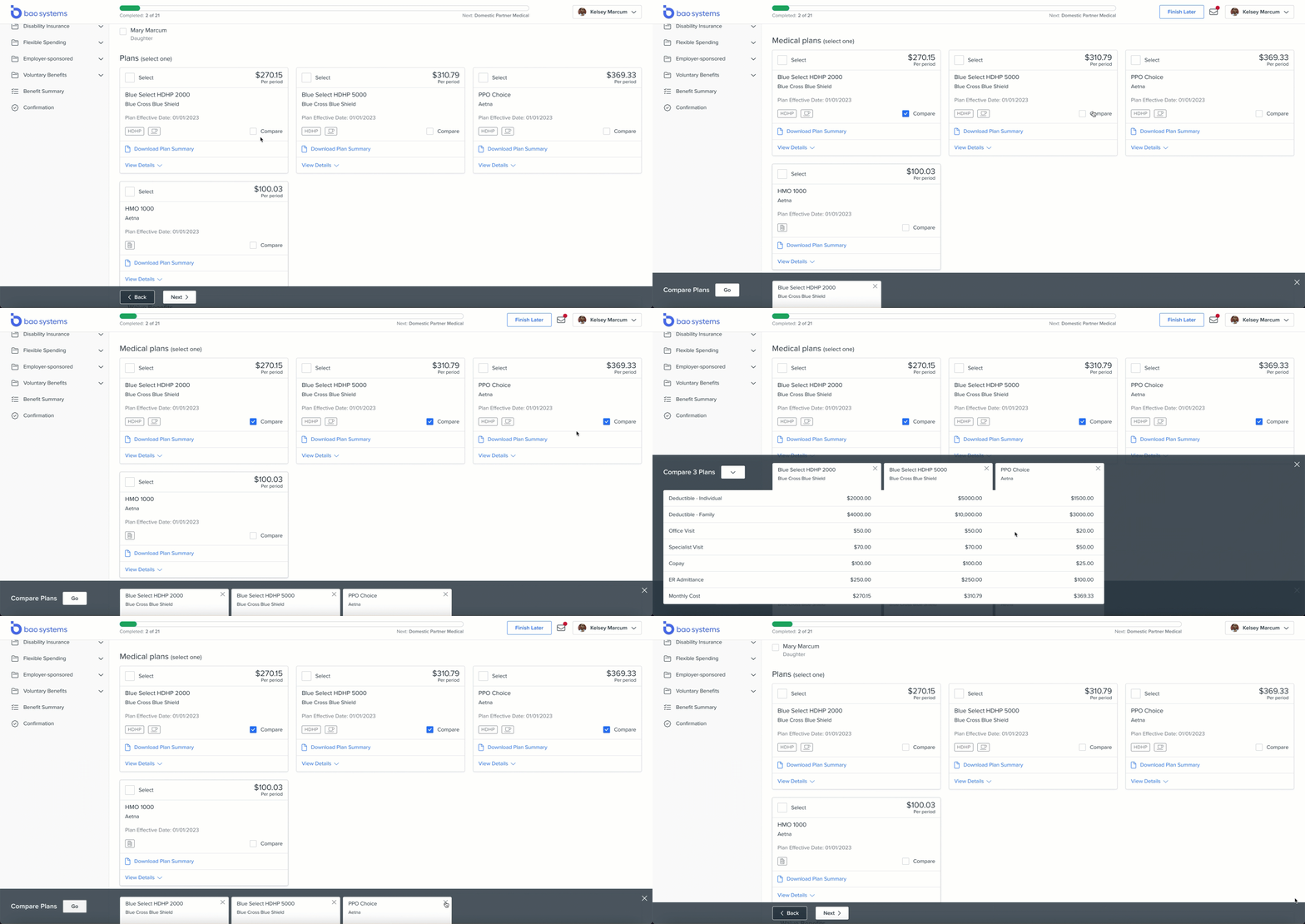
The existing plan comparison feature was clunky, hard to use, and didn't support smaller screen sizes.
I analyzed the compare features on a number of e-commerce sites and designed a new plan comparison tool that used familiar patterns while being tailored to benefits data. The tool is fully responsive and supports widely varying amounts of text, since the comparison attributes are fully configurable and localizable.
The final interaction design was a suggestion from our amazing front end dev lead, which I fleshed out into the final design. It ended up being one of my favorite parts of the project!
Responsive by Design
Over half of the visits on Prism's employee experience apps come from mobile, so it was crucial for the design to support a range of devices and screen sizes.
Our UX team defined 4 breakpoints for the overall Unified Employee Experience project, ranging from small (mobile) up to XL (wide desktop). For every BE screen I created designs for each breakpoint and tested the implemented version on multiple screen sizes.
Theming
Prism's HR outsourcer customers need to be able to “white label” our platform to resell to their own clients. In keeping with our overall UEX theming approach, the new Benefits Enrollment design supports custom logos and two colors: a link/interactive color and an accent color.
The navigation automatically calculates its background color based on the selected accent color.
Making Benefits Enrollment Accessible
I advocated for accessibility throughout the Unified Employee Experience project. This was the first project at Prism to target full WCAG compliance, so I worked with the rest of the UX team to educate the dev & QA teams along the way.
I wrote accessibility requirements into every BE user story and tested the implemented designs for accessibility. We achieved WCAG AA compliance for the new design — a first for PrismHR's apps!
Collaborating with a Globally Distributed Team
I held regular design review and technical feasibility meetings with the cross-functional leads, and walked through the designs with the whole team in our weekly refinement sessions.
I aimed to finish my parts of tasks before I left at night to keep the India team moving during their work day, and I often met with the overseas folks before US business hours.
I wrote detailed specifications in Figma to keep the distributed team on the same page, and I worked closely with the dev team during implementation and tested every development story for design and functionality.
Wearing the Product Manager Hat
When our awesome product manager went out on leave right before our major deadline, I stepped in to fill the gap.
I worked with the cross-functional lead to prioritize the team's backlog and write user stories. I ran team refinement sessions and led our quarterly planning meetings. I also represented the team to the many stakeholders who were very interested in the project's progress.
My help enabled the team to maintain momentum and meet our tight deadline.
Representing the Team at PrismHR LIVE
We met our goal of showing working software at our PrismHR LIVE conference. Since our product manager was on leave, I represented the team. I ran customer demos, gathered feedback about the new design direction, and ran hands-on prioritization activities.
“Just got off a [client] smb sales demo. The prospect ... said our OB/BE/EP look way more advanced than the software that they are using with ADP ... great news.” — Sales engineer
The Results
We shipped a beta in September, and the finished experience in November. We got extremely positive feedback from customers and our internal and channel sales teams.
“Had 3 smb sales demos yesterday ... prospects are loving the demo and the clients are happy. The new UEX combined with the Enhanced Dashboard sure do lift the cloud and participants are paying closer attention to how advanced the OB/BE is ... I’m so proud of us!” — Sales engineer
The Unified Employee Experience project won a bronze Stevie Award from the American Business Awards in the New Product category.
But maybe the most satisfying outcome was being able to use the redesigned experience to enroll in my own benefits!