Service Design & Workflow Work
Designing and improving complex systems
It's easy to focus on "designing the thing right" (the UI details) and lose sight of "designing the right thing" (a product that solves real user needs). I use a number of tools to understand the user's larger workflow so we can choose the most important user needs to address.
As I work, I practice "zooming out" to look at the big picture, and then "zooming in" to focus on the UI details and microinteractions.
Example 1: Customer Journey Analysis for PrismHR Employee Experience
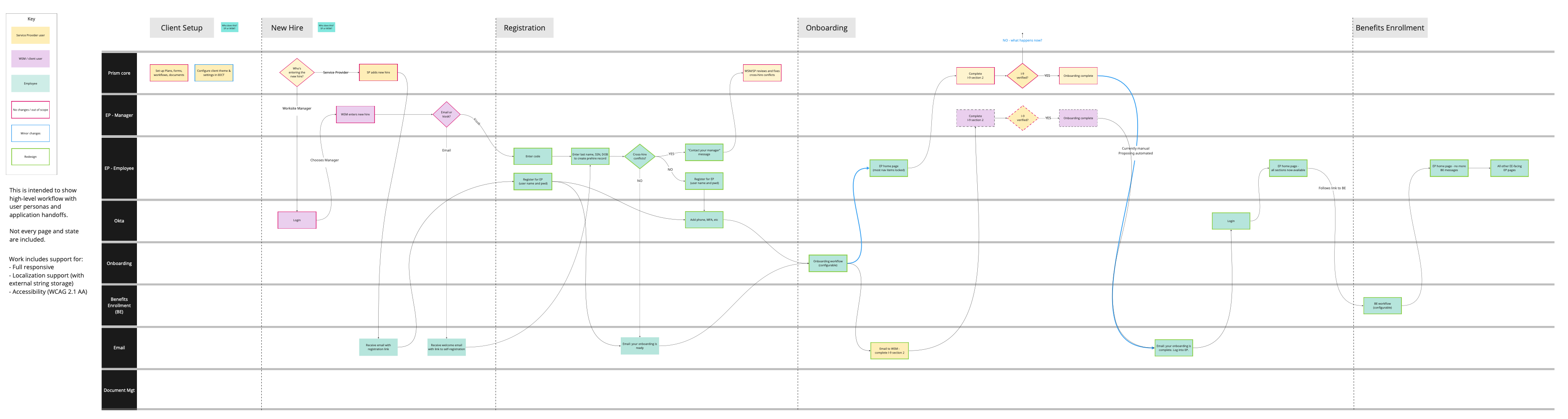
My team at PrismHR was tasked with delivering a new "unified employee experience" for our end users under a very tight timeframe. The employee experience is made up of multiple applications, each with its own team, across several tech stacks — so ensuring a consistent experience was a challenge. Before beginning design, I wanted to be sure we understood the overall journey across all the application touchpoints.
I made this journey map in Miro, with input from the other designers, to show the frontstage and backstage workflows for the Employee Experience applications. The diagram uses vertical swim lanes to illustrate the applications users pass through. The green blocks show the SMB employee, the target user; the employee goes through multiple applications and screens in a single session, highlighting the need for a unified experience.
Separately, we also grabbed screenshots of each application to show the discrepancies in the experience across applications.
Overall, the map showed that each application was internally consistent, but the handoffs between applications were awkward and resulted in a lot of cognitive load for the user.
We used the map to socialize the project with stakeholders and to ensure the overall experience was consistent as design progressed (my design work for this project is detailed in the Benefits Enrollment case study). The map also made a strong case for devoting additional resources to our registration flow, an area of the product that traditionally received less attention.
Results
Our Unified Employee Experience project won a bronze Stevie Award from the American Business Awards in the New Product category. The redesign got rave reviews from customers and internal stakeholders; we were able to retire the legacy system a little over six months after launch, which is a record for PrismHR migrations.
Example 2: Collaborative Workflow Mapping for MathWorks Test Results Database (TRDB)
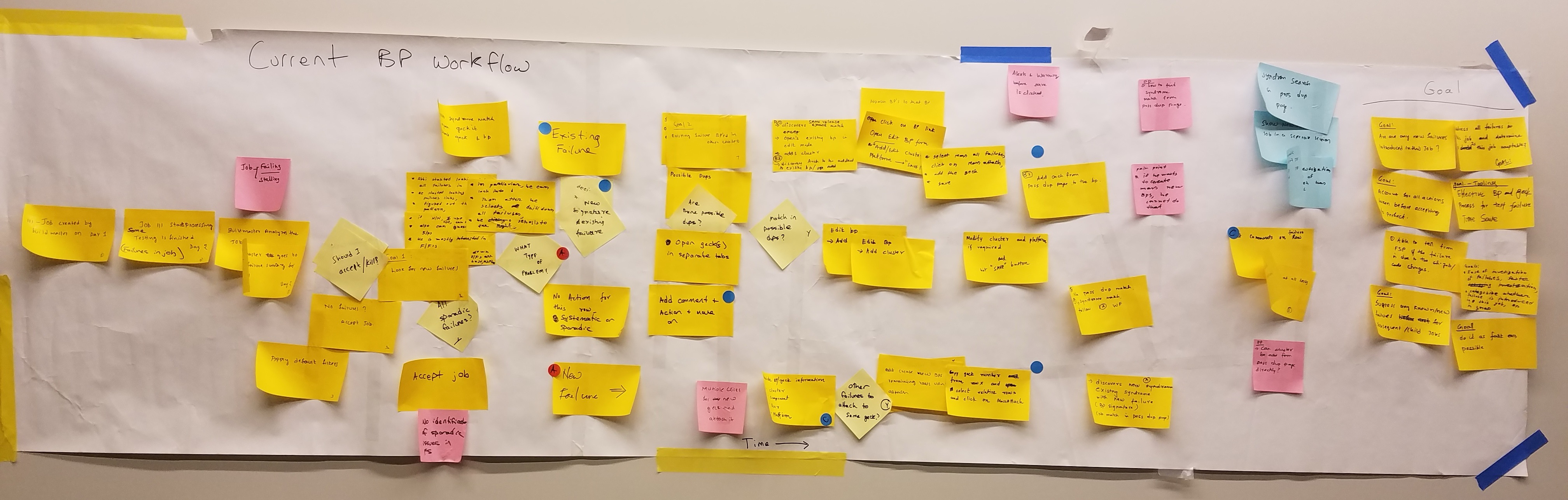
This internal app is used by 1500+ members of the MathWorks development organization to review and investigate failures in automated software tests.
My initial research suggested that the user workflow required a large number of manual, repetitive steps.
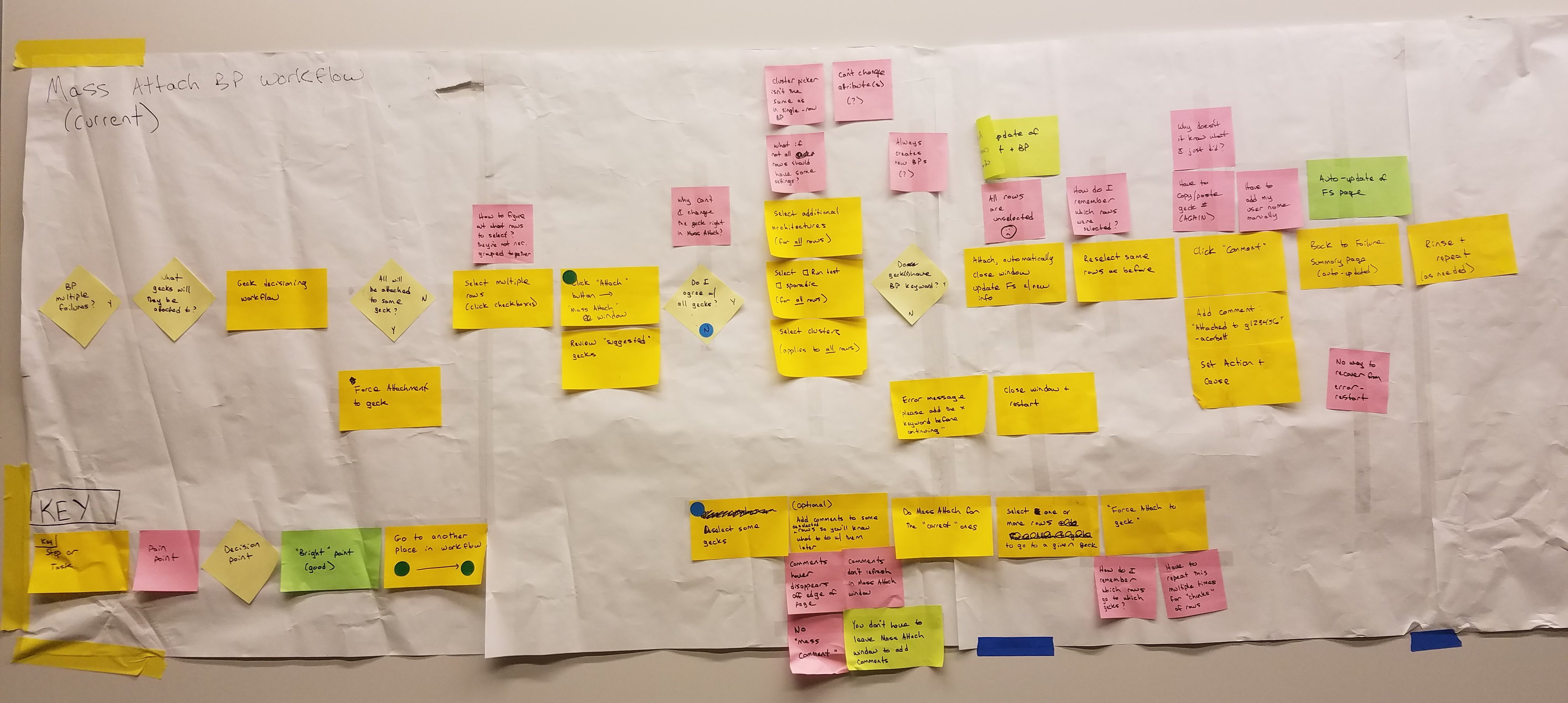
I ran a series of collaborative workflow mapping exercises with the team to help us understand the major workflows in the app and identify pain points. Here's an example of the output for one of the key workflows.
I cleaned up the output a bit and broke it out into smaller diagrams for individual pieces of the workflow.
Afterwards I converted some of the key diagrams to digital versions in Visio, like below.
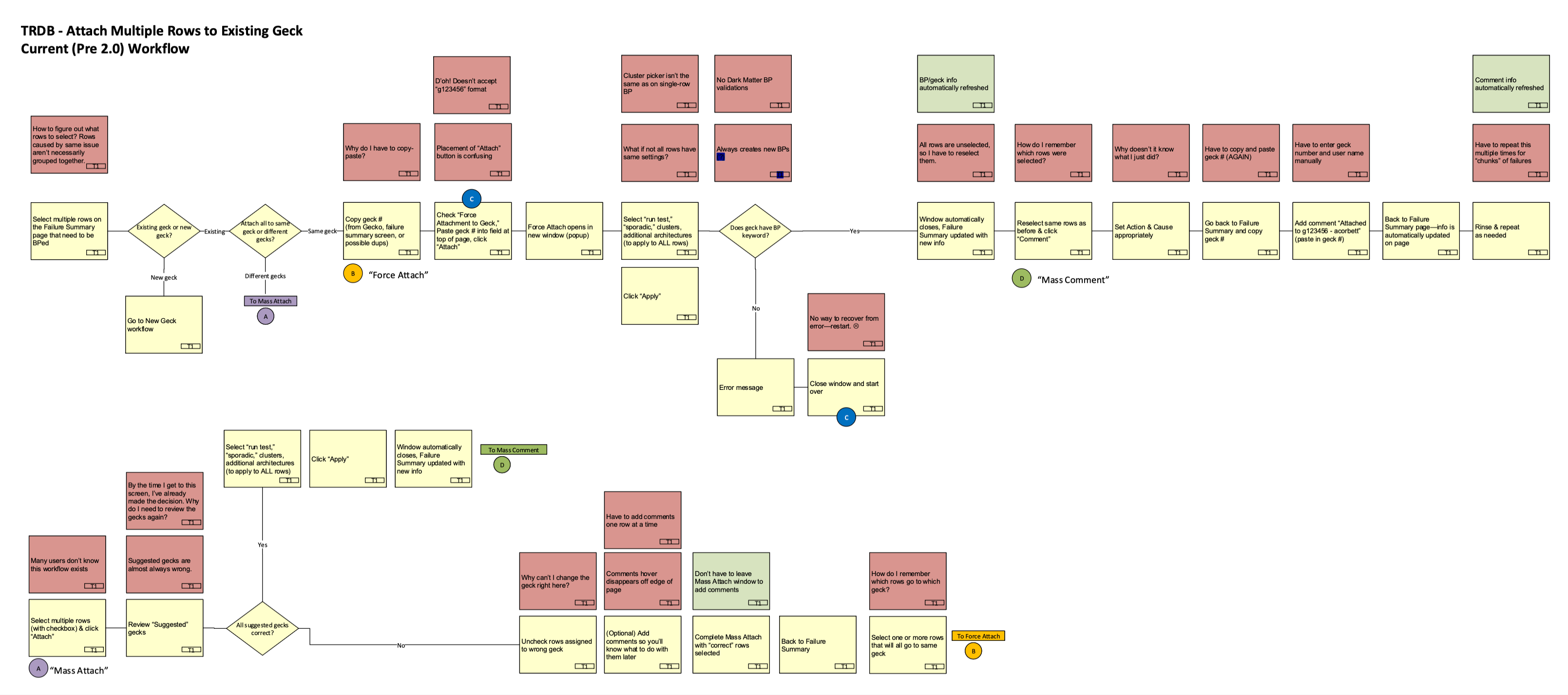
We used the output of the workflow mapping exercise to identify the most important pain points to address. After iterating on the design, we did another workflow map of the proposed future design to ensure that we were adressing the key pain points.

Results
The workflow mapping helped us significantly reduce the number of steps in key workflows. For example, the workflow above went from 12 steps to 3 for the most common use case: a reduction of three quarters! Users had to go through each of these workflows many times a day, so this significantly reduced overall failure investigation time.
We also removed many decision points that were causing cognitive fatigue — and we used the learnings as input into other process improvement initiatives, including experiments with machine learning.